Introduction
Imagine a customer rushing along a Brooklyn sidewalk, phone in hand, searching for a nearby place to grab lunch before a meeting. She taps the first result that loads quickly and looks easy to use, and she never scrolls to the second. In New York, that split second decides which business wins the sale.
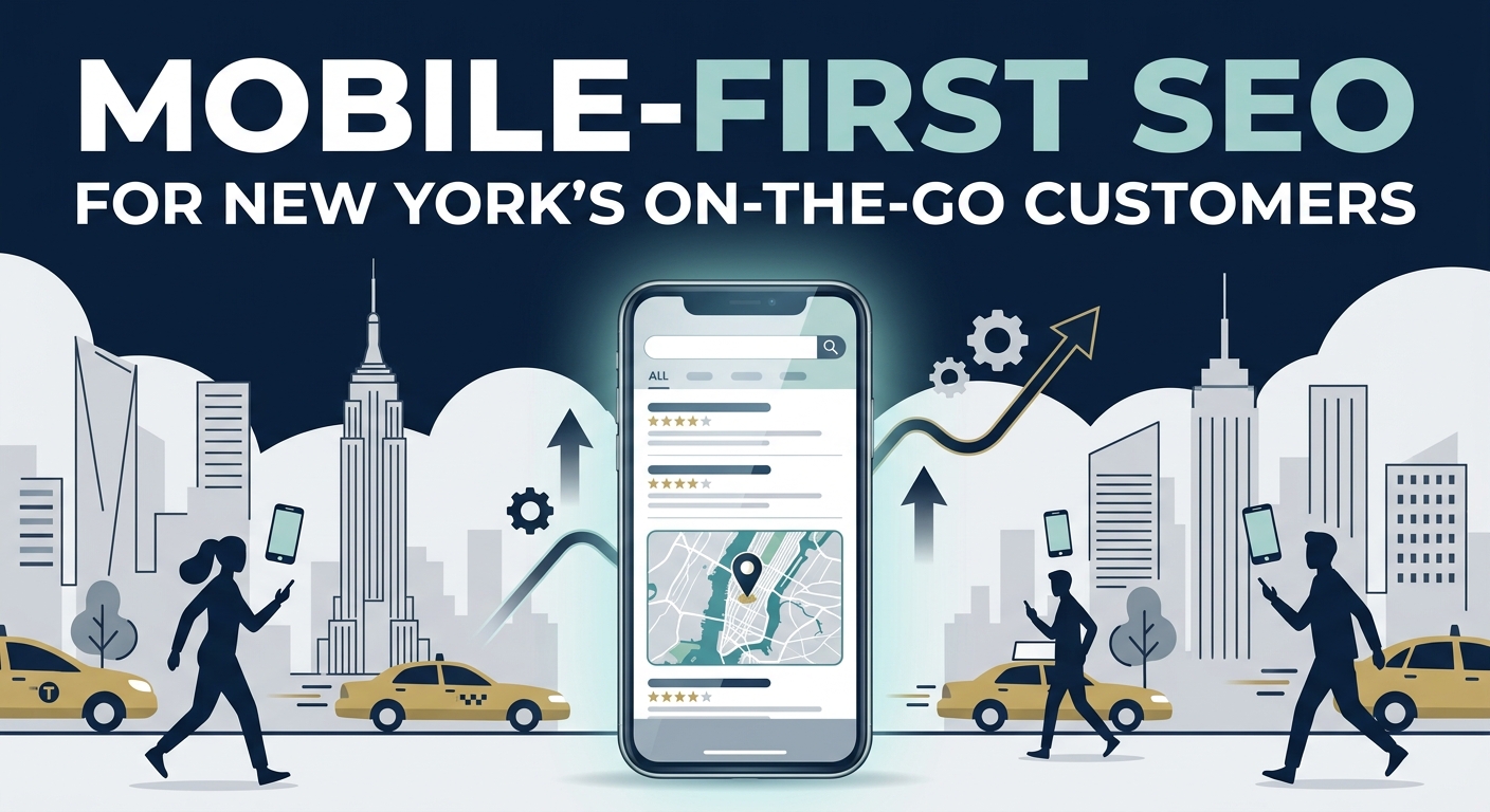
Mobile-first SEO is the practice of designing and optimizing your website primarily for smartphone users, since search engines now judge your site mainly by its mobile version. It covers speed, layout, content clarity, local signals, and technical health, all viewed through the eyes of someone on a small screen. For businesses serving a fast moving city, it is no longer a nice extra but the foundation of online visibility.
New York customers are some of the busiest and most demanding in the world. They search between subway stops, in elevator rides, and while waiting for a crosswalk signal, and they expect answers right away. Businesses that meet them with fast, clear, and helpful mobile experiences earn calls, bookings, and visits, while others simply disappear from consideration.
This guide explains why mobile-first matters so much in New York and how search engines evaluate mobile websites. It also explores who the on-the-go customer really is and how behavior changes across the five boroughs. The later parts cover design, speed, content, local tactics, measurement, and the mistakes that quietly cost businesses customers.
Why Mobile-First Matters for New York Businesses
New York is a city built around movement, and the smartphone is the tool people reach for in almost every moment of that movement. Residents commute by train and bus, tourists navigate unfamiliar streets, and workers squeeze errands into short breaks. All of these moments begin with a quick search on a small screen.
Several realities make mobile-first thinking especially important in this city:
- Most local searches happen on phones, often within minutes of a purchase decision.
- Subway and bus commutes create countless short bursts of browsing with limited attention.
- Dense neighborhoods put many competitors within a few blocks, so small experience differences decide who wins.
- Tourists and newcomers rely heavily on mobile search to find food, services, and directions.
- Urgent needs such as repairs, medical care, and last minute bookings favor businesses that load fast and respond fast.
Search engines reward this reality by measuring how well your mobile pages serve real visitors. A site that looks perfect on a desktop but struggles on a phone can lose rankings, even if its content is excellent. The business consequence is direct, because lower visibility means fewer calls, fewer visits, and less revenue.
Competition raises the stakes further. In a market where hundreds of similar businesses may sit within walking distance, the one with a smooth mobile experience usually captures the impatient customer. Treating mobile as the main version of your website, rather than an afterthought, gives you a real advantage.
How Mobile-First Indexing Works
Mobile-first indexing means that search engines primarily use the mobile version of your website to crawl, understand, and rank your pages. If your desktop site contains rich information that your mobile site hides or removes, the search engine may never see it. This makes consistency between the two versions critical.
In practice, the process works in a few clear steps:
- A search crawler visits your site using a smartphone style user agent.
- It reads the mobile version of your content, links, images, and structured data.
- It evaluates how the page performs, including loading speed and layout stability.
- It stores what it finds and uses that version to decide where you appear in results.
- It compares signals such as relevance, usability, and trust against competing pages.
The most common problems appear when mobile pages carry less content than desktop pages. Hidden text, missing headings, stripped images, and lighter navigation can all weaken your rankings. Equally damaging are blocked resources, intrusive pop ups, and buttons so small that visitors struggle to tap them.
A healthy mobile-first setup keeps the same valuable content, headings, links, and structured data on both versions. The mobile layout may be simpler in appearance, but it should never be thinner in substance. Think of it as the same store with the same shelves, simply arranged for a narrower doorway.
Understanding the On-the-Go New York Customer
To optimize well, you need to picture the person on the other end of the screen. The on-the-go New Yorker is usually short on time, juggling several tasks, and searching with a clear goal in mind. They are not browsing for entertainment but looking for a quick, trustworthy answer.
Their behavior follows recognizable patterns:
- They search in short sessions, often between other activities, and abandon slow pages almost instantly.
- They scan instead of reading, looking for hours, prices, directions, and a way to contact you.
- They compare several options quickly, often opening multiple results before deciding.
- They trust reviews, ratings, and recent photos to confirm that a business is worth their time.
- They prefer tapping to call, book, or navigate over filling out long forms.
Context shapes intent just as much as behavior does. A search made at seven in the morning near a train station usually signals a commuter needing coffee or a quick breakfast. A search at midnight for a pharmacy or locksmith signals urgency, and the business that answers clearly and quickly often wins the customer on the spot.
Understanding these patterns lets you design pages that serve real needs. Your most important information should appear within the first screen, your contact options should be a single tap away, and your content should answer the obvious questions without making visitors hunt. Every second you save the customer increases the chance they choose you.
How Mobile Behavior Differs Across the City
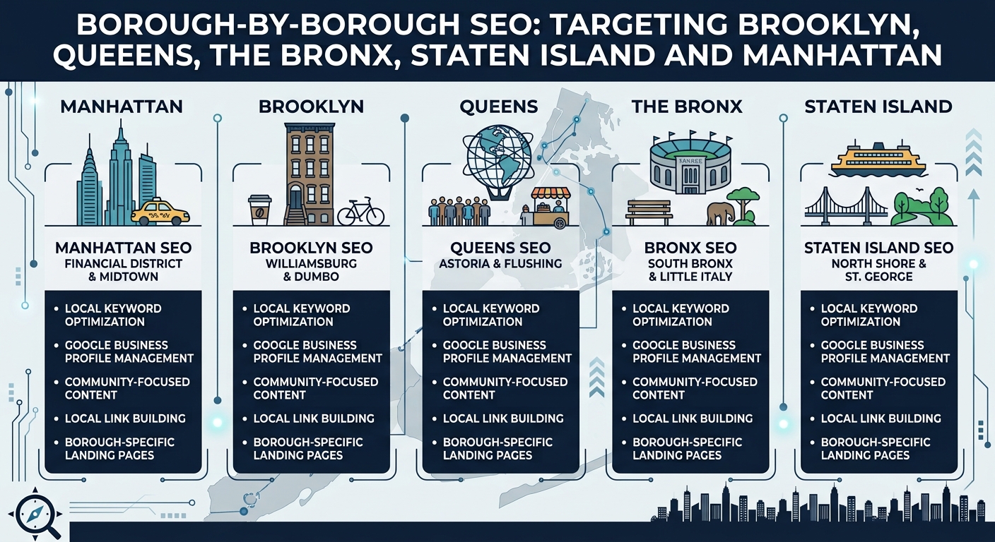
New York is not one audience but a collection of distinct communities, each with its own habits and priorities. A strategy that fits a Midtown lunch crowd may need adjusting for a family oriented neighborhood in Queens or a car dependent area on Staten Island. Matching your approach to local patterns improves both rankings and conversions.
Manhattan tends to produce fast, high volume searches from workers, visitors, and commuters who want immediate answers. Brooklyn and Queens often show neighborhood focused searches, with people looking for trusted local favorites and family friendly services. The Bronx and Staten Island frequently highlight practical needs, where reliability, parking, and clear directions carry extra weight.
| Borough | Typical Mobile Searcher | Common Mobile Searches | Optimization Focus |
|---|---|---|---|
| Manhattan | Commuters, office workers, tourists | Open now restaurants, coffee, pharmacies, quick services | Fast loading pages, accurate hours, subway proximity |
| Brooklyn | Residents, young professionals, families | Local cafes, salons, fitness studios, boutique shops | Neighborhood pages, reviews, strong visuals |
| Queens | Diverse families and commuters | Cuisine specific dining, clinics, auto services | Multilingual content, service details, parking information |
| The Bronx | Local residents and families | Urgent care, groceries, repair services, dining | Tap to call buttons, clear directions, trust signals |
| Staten Island | Car dependent households | Home services, medical offices, retail stores | Service area details, parking, easy contact options |
Beyond boroughs, individual neighborhoods carry even more influence on how people search and decide. Customers often mention specific areas, streets, or landmarks in their queries, so including those details in your content helps search engines connect you to the right audience.

Responsive Design and Mobile User Experience
Responsive design means your website automatically adapts its layout to fit any screen, from a small phone to a large desktop monitor. For New York customers who often search one handed while walking or standing on a train, a layout that adjusts smoothly is essential. A site that forces pinching, zooming, or sideways scrolling quickly loses the visitor.
Good mobile experience goes beyond shrinking a desktop page. It means rethinking how information is arranged so that the most important details appear first and everything is easy to reach with a thumb. Visitors should understand who you are, what you offer, and how to contact you within a few seconds of landing.
Key principles for a strong mobile experience include the following:
- Use a single column layout with clear spacing so content never feels crowded.
- Make buttons and links large enough to tap easily, with enough space between them to prevent mistakes.
- Choose readable font sizes so visitors never need to zoom in to read text.
- Keep navigation simple, with a short menu and a visible search option for larger sites.
- Place the phone number, address, and main call to action near the top of every key page.
Testing is just as important as design. Open your site on several real devices, including older phones and smaller screens, because many customers do not use the newest models. Walk through common tasks such as finding your hours, calling your business, or booking a service, and fix any step that feels slow or confusing.
Page Speed and Core Web Vitals
Speed is one of the strongest factors in mobile success, especially for New Yorkers who may be on a crowded cellular network in a subway station or a busy street. Most visitors will leave a page that takes more than a few seconds to show useful content. Search engines also measure speed and stability through a set of signals known as Core Web Vitals.
These signals focus on three parts of the visitor experience, which are summarized below.
| Core Web Vital | What It Measures | Good Target | Common Fix |
|---|---|---|---|
| Largest Contentful Paint | How quickly the main content appears | Under 2.5 seconds | Compress images, use fast hosting, reduce heavy scripts |
| Interaction to Next Paint | How quickly the page responds to taps and clicks | Under 200 milliseconds | Remove unnecessary scripts, simplify page features |
| Cumulative Layout Shift | How stable the layout stays while loading | Under 0.1 | Set image dimensions, reserve space for ads and embeds |
Improving speed usually starts with images, since large files are the most common cause of slow pages. Compress every image, use modern formats, and load images below the first screen only when the visitor scrolls to them. These steps alone can cut loading time dramatically without changing how the site looks.
Other helpful speed improvements include:
- Choose reliable hosting with servers that respond quickly to visitors in the New York region.
- Use browser caching so returning visitors see your pages almost instantly.
- Minimize code files and remove plugins or tools you no longer use.
- Consider a content delivery network so files load from a location close to the visitor.
- Monitor performance regularly, since new features and images can slow a site over time.
Mobile Friendly Content That Gets Read
Mobile visitors scan before they read, so your content must be organized for quick understanding. Long blocks of text feel heavy on a small screen and often cause visitors to leave. Short paragraphs, clear headings, and helpful lists keep people engaged and moving toward action.
Start each page with the answer most visitors want. If someone searches for a plumber in Queens, the first screen should confirm your service, your area, and how to reach you quickly. Supporting detail can follow below for those who want to learn more.
Effective mobile content habits include the following:
- Write short paragraphs of two or three sentences so text never feels overwhelming.
- Use descriptive headings that tell visitors exactly what each section contains.
- Add bullet lists for services, prices, and features that people want to compare quickly.
- Include real photos of your location, team, and products to build trust at a glance.
- End each page with a clear next step, such as calling, booking, or getting directions.
Search intent should guide every page you create. Some visitors want quick facts, while others want to compare options or learn before buying, so match the depth of your content to their purpose. Pages that serve the real need behind the search tend to earn better rankings and stronger conversions.
Video and visual content can help when used carefully. Short, compressed clips and clean images explain services quickly, but heavy media should never slow the page. Always provide text alongside visuals so that search engines and visitors on slow connections still understand your message.
Local SEO for Mobile Searchers
Most mobile searches in New York carry local intent, since people want something nearby and available now. This makes local SEO and mobile SEO deeply connected, and success in one strengthens the other. A fast mobile site paired with a strong local presence gives you the best chance of being chosen.
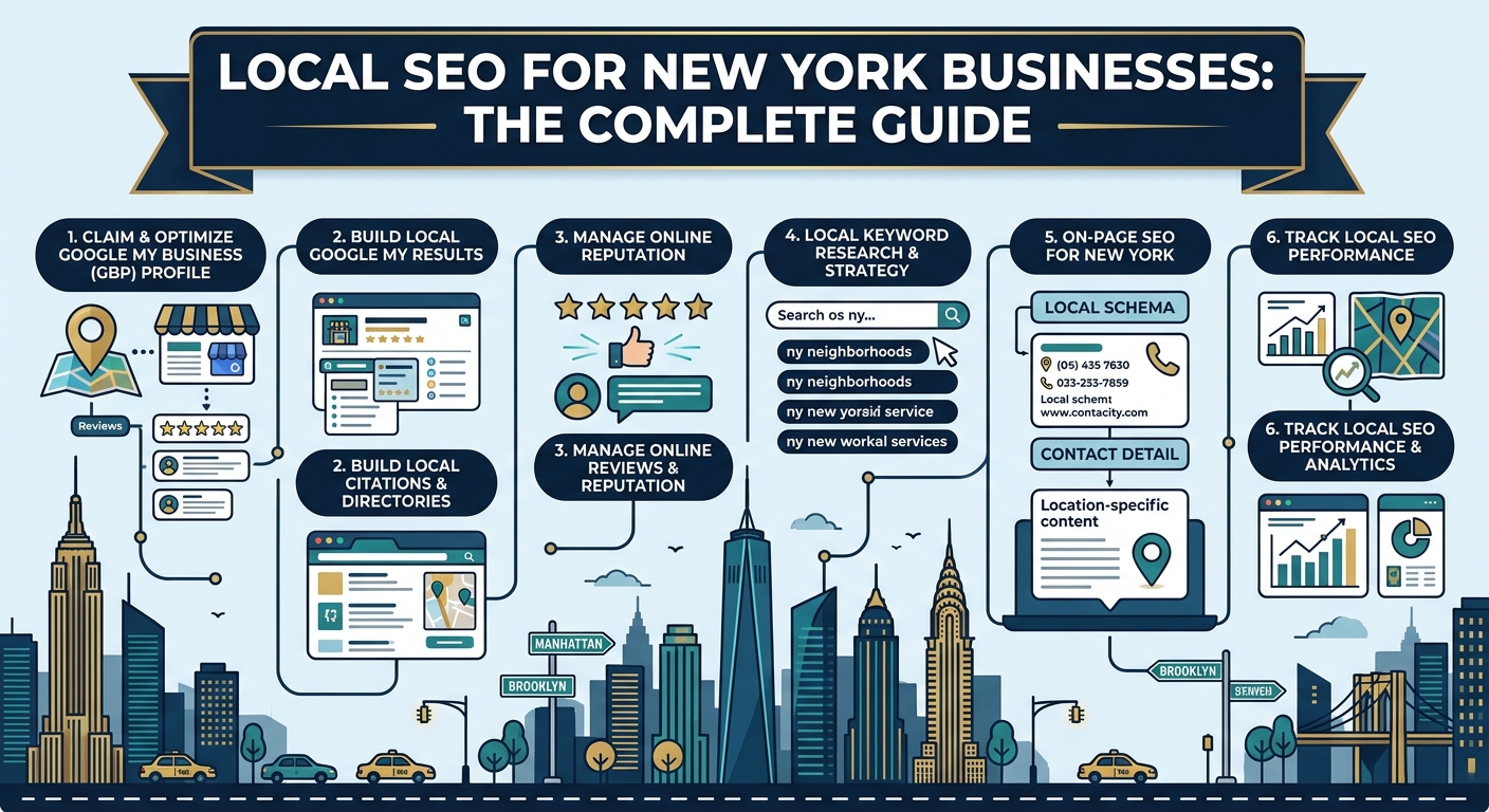
Your Google Business Profile is the heart of local mobile visibility. Keep your name, address, phone number, hours, and categories accurate, and add photos, services, and regular updates. Many mobile searchers act directly from the profile by calling or requesting directions, so it often matters more than the website itself.
To strengthen local mobile performance, focus on these actions:
- Create a helpful page for each neighborhood or location you serve, with real local details such as nearby subway lines and landmarks.
- Keep your business name, address, and phone number consistent across every directory and social profile.
- Encourage happy customers to leave reviews, and reply to feedback politely and promptly.
- Add click to call and click for directions buttons so visitors can act in one tap.
- Mention special hours, holiday changes, and temporary closures as soon as they happen.
Reviews deserve special attention because mobile customers rely on them to decide quickly. A steady flow of recent, authentic feedback signals that your business is active and trusted. Responding thoughtfully to both praise and criticism shows future customers that you care about their experience.
Technical Foundations for Mobile Crawling
Even the most beautiful mobile site will struggle if search engines cannot crawl and understand it properly. Technical health ensures that your pages can be discovered, read, and ranked fairly. Think of it as the plumbing behind the walls, rarely noticed but essential for everything to work.
Begin by making sure your mobile and desktop versions carry the same core content, headings, and links. Hidden or removed sections on mobile can lead search engines to overlook valuable information. Confirm that your important pages, images, and scripts are not blocked from crawlers by accident.
Important technical checks include the following:
- Use a responsive design with the same web address for mobile and desktop to avoid duplicate content issues.
- Secure your site with HTTPS so visitors and search engines trust your pages.
- Submit an up to date sitemap and fix broken links, redirects, and error pages.
- Add structured data for your business, services, reviews, and frequently asked questions.
- Avoid intrusive pop ups and full screen overlays that block content on small screens.
Run regular audits to catch problems early. A monthly check of crawl errors, loading speed, and mobile usability reports can reveal small issues before they grow. Consistent maintenance keeps your site healthy and protects the rankings you have worked hard to earn.
Conversion Design for Small Screens
Traffic only matters if it turns into customers, and conversion design is what makes that happen on a phone. The goal is to remove friction so that an interested visitor can call, book, or buy with as few taps as possible. On a small screen, every extra step costs you customers.
Place your main action where thumbs naturally reach, and make it impossible to miss. A sticky button at the bottom of the screen that offers a call or a booking can keep your action visible as visitors scroll. Use clear, specific button text such as Call Now or Book Your Appointment instead of vague phrases.
Forms deserve extra care on mobile, since typing on a small keyboard is slow and frustrating. Consider these improvements:
- Ask only for the information you truly need, such as name, phone number, and a short message.
- Use the correct keyboard type for each field, such as a number pad for phone numbers.
- Enable autofill so visitors can complete forms in a few seconds.
- Offer alternative options such as tapping to call, sending a text, or using a messaging link.
- Show clear confirmation messages so visitors know their request went through.
Trust signals also help busy customers decide quickly. Display star ratings, short testimonials, recognizable payment options, and clear pricing where possible.

Tools and Metrics for Mobile SEO Performance
Measuring mobile performance starts with separating phone visitors from desktop visitors in your analytics. Many businesses look only at overall totals and miss the fact that their mobile experience is quietly underperforming. Comparing the two groups side by side shows exactly where phone users struggle and where they succeed.
Several free and paid tools make this easier. Search performance reports show how your pages appear and perform on mobile devices, while speed testing tools reveal loading problems and Core Web Vitals scores. Analytics platforms add behavior data such as scroll depth, taps on call buttons, and completed bookings.
| Metric | What It Shows | Why It Matters |
|---|---|---|
| Mobile Traffic Share | Portion of visits coming from phones | Confirms how much of your audience depends on the mobile experience |
| Core Web Vitals Scores | Loading speed, responsiveness, and layout stability | Directly affects rankings and visitor patience |
| Mobile Bounce Rate | Share of phone visitors who leave after one page | High numbers often point to slow or confusing pages |
| Click to Call and Direction Taps | Actions taken from your pages and listings | Reflects strong local intent from on the go customers |
| Mobile Conversion Rate | Share of phone visitors who book, call, or buy | Shows whether your design turns visits into revenue |
| Local Pack Visibility | How often you appear in map results | Indicates strength for nearby searches across NYC |
Review these numbers monthly and look for trends rather than reacting to single bad days. Testing your own site on a real phone, using a cellular connection instead of office Wi-Fi, also gives honest insight into what customers experience. Keep a simple log of changes so you can connect improvements to results.
Common Mobile SEO Mistakes NYC Businesses Make
Most mobile problems come from small oversights that go unnoticed because owners usually review their sites on a large screen. Catching them early protects your rankings and your customers’ patience. The most frequent mistakes are listed below:
- Letting images and scripts slow pages until visitors leave before the content appears.
- Hiding important content on the mobile version that appears on the desktop version.
- Using tiny buttons and links that are hard to tap with a thumb.
- Showing pop ups that cover the screen and frustrate visitors right away.
- Leaving hours, phone numbers, and addresses outdated across the website and listings.
- Burying the call button or booking option far below the first screen.
- Ignoring neighborhood level content and relying on a single generic city page.
Another costly error is treating mobile optimization as a one time project. Devices, search features, and customer habits keep changing, so a site that was fast last year may feel slow today. Regular audits and steady improvements keep you ahead of competitors who set their sites and forget them.
A final mistake is focusing on rankings while ignoring what happens after the click. A page that ranks well but confuses visitors wastes the opportunity it has earned. Pairing good visibility with clear design and easy actions produces the strongest results.
The Future of Mobile Search in New York
Mobile search is moving toward faster, more conversational, and more personalized experiences. People increasingly use voice, images, and AI generated summaries to find answers without typing long queries. Businesses with clear, accurate, and well structured information will be the ones these systems choose to feature.
Personalization will also deepen, with results shaped by location, time of day, language, and past behavior. In a multilingual city like New York, offering helpful content in several languages could become a real competitive edge. Faster networks and smarter devices will raise expectations further, making slow or cluttered pages even less acceptable.
Brands that build strong foundations now will adapt most easily. Fast pages, honest reviews, consistent listings, and genuinely helpful content remain valuable no matter how interfaces evolve. Staying flexible and learning from your data keeps your business visible as the landscape changes.
Why Choose Dealmate
Dealmate helps New York businesses win the attention of customers who search on the move. Our team combines mobile-first SEO knowledge with practical experience in speed optimization, local visibility, and conversion focused design. Every strategy is shaped around your neighborhood, your audience, and your goals.
We keep the process transparent so you always understand what is being done and why it matters. Here is what you can expect when working with Dealmate:
- A complete mobile audit covering speed, usability, content, and technical health.
- Neighborhood focused content written for the way New Yorkers search and decide.
- Performance improvements that make your pages fast and stable on cellular networks.
- Local listing and review support that strengthens your presence in map results.
- Clear monthly reports covering traffic, calls, directions, and conversions.
Frequently Asked Questions
What does mobile-first SEO mean?
Mobile-first SEO means optimizing your website mainly for smartphone users. Search engines now use the mobile version of your site to decide how it ranks. This makes speed, layout, and content clarity on small screens essential. A strong mobile experience supports visibility and conversions at the same time.
Why is mobile SEO so important for New York businesses?
New Yorkers rely heavily on their phones while commuting, walking, and running errands. Many of their searches have urgent local intent and lead to calls or visits within hours. Dense competition means small experience differences can decide who wins the customer. Businesses with fast, clear mobile sites capture more of these moments.
How fast should my mobile website load?
Aim for the main content to appear in under two and a half seconds on a typical cellular connection. Faster loading keeps impatient visitors on the page. Compress images, reduce heavy scripts, and use reliable hosting to improve speed. Regular testing helps you catch slowdowns before they cost customers.
What are Core Web Vitals?
Core Web Vitals are signals that measure loading speed, responsiveness, and layout stability. They reflect how smooth a page feels to real visitors. Search engines use them as part of their evaluation of page experience. Improving them also tends to improve conversions and customer satisfaction.
Does my desktop site still matter?
Your desktop site still serves many visitors, but search engines mainly judge the mobile version. If the mobile version has less content, your rankings can suffer. Keep core content, headings, links, and structured data consistent on both. A responsive design makes this much easier to maintain.
How does local SEO connect to mobile SEO?
Most mobile searches in New York have local intent, such as finding a nearby service that is open now. A complete Google Business Profile and consistent listings help you appear in those results. Fast pages then turn the visit into a call or booking. Together they create a strong path from search to customer.
What makes a mobile page convert better?
Clear actions placed within easy thumb reach make a big difference. Click to call buttons, short forms, and visible trust signals reduce friction. Pages should answer the main question on the first screen. Every extra step you remove increases the chance of a booking.
Are pop ups bad for mobile SEO?
Intrusive pop ups that cover the content can frustrate visitors and may harm your search performance. Small banners that are easy to close are generally safer. Avoid showing full screen overlays as soon as a page loads. Keep the focus on helping visitors reach the information they came for.
How often should I audit my mobile site?
A quick monthly check of speed, usability, and crawl reports works well for most businesses. A deeper review every quarter helps you catch larger issues. Audit again after any redesign or major content change. Consistent attention prevents small problems from becoming costly ones.
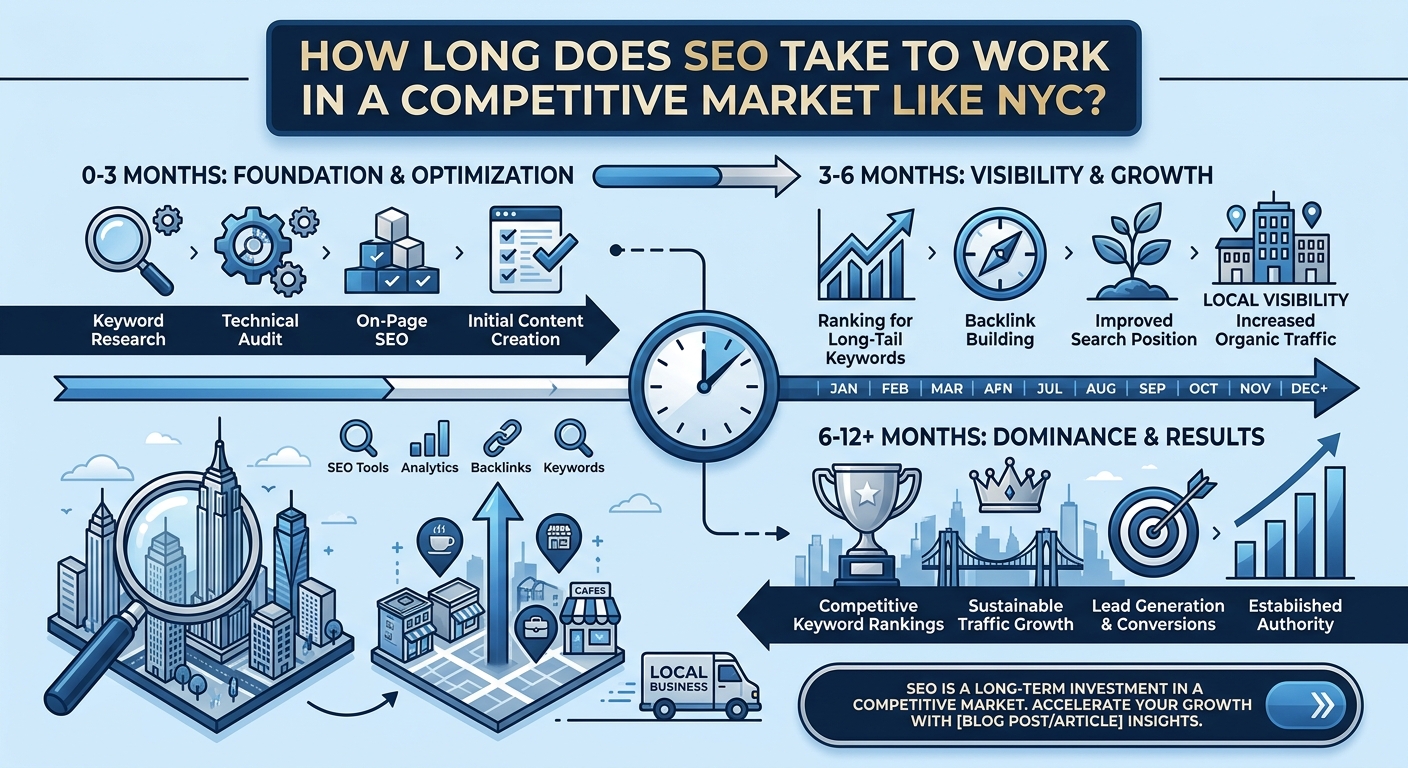
How long does it take to see results from mobile SEO?
Simple fixes such as faster images and corrected listings can show effects within weeks. Larger improvements in rankings and conversions often take a few months. Results depend on competition and your starting point. Steady, consistent work usually delivers more lasting gains than one time efforts.
Conclusion
Mobile-first SEO has become the foundation of online visibility for businesses serving New York’s busy customers. Search engines judge your site primarily by its mobile version, and impatient visitors reward the businesses that load fast and make action easy. Those that prepare well will capture customers at the exact moment they are ready to choose.
The path forward is to combine responsive design, strong speed, helpful content, local signals, and solid technical health. Measure your progress, fix mistakes quickly, and keep improving as devices and search features evolve.