
Mobile optimization is an important part of WordPress website SEO because many visitors access websites through smartphones and tablets. A page that looks excellent on a desktop can still provide a poor experience on a smaller screen.
Mobile SEO is not simply about shrinking a desktop layout. It is about making the entire website easy to use, fast to load, and accessible across different devices.
Use a Responsive WordPress Theme
A responsive theme automatically adapts the layout to different screen sizes.
However, installing a responsive theme does not mean every page will automatically be perfect. Test your actual pages after adding content, images, forms, tables, and other elements.
Pay particular attention to pages created with page builders, as individual sections may behave differently on mobile.
Improve Mobile Loading Speed
Mobile users may browse on slower connections or less powerful devices.
Large images and unnecessary scripts can increase loading time.
Start by:
- Compressing images
- Using suitable image dimensions
- Removing unnecessary plugins
- Reducing excessive scripts
- Reviewing caching
- Choosing reliable hosting
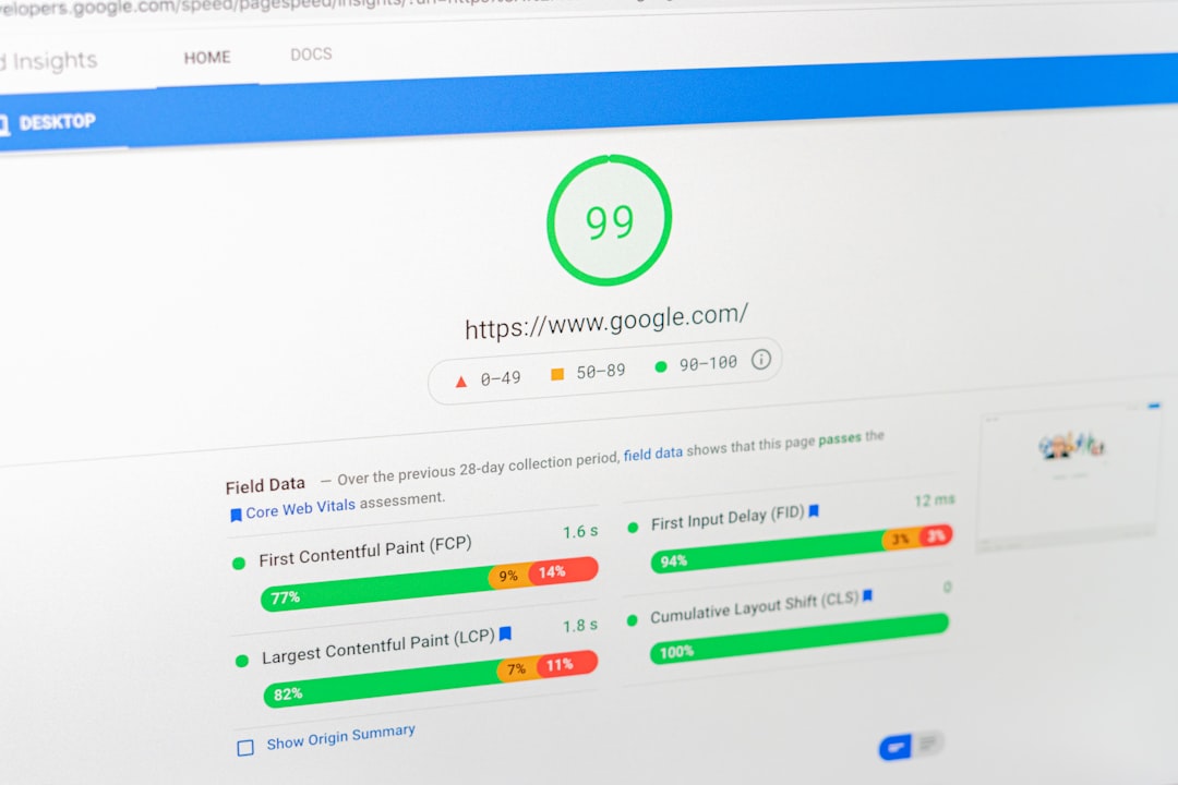
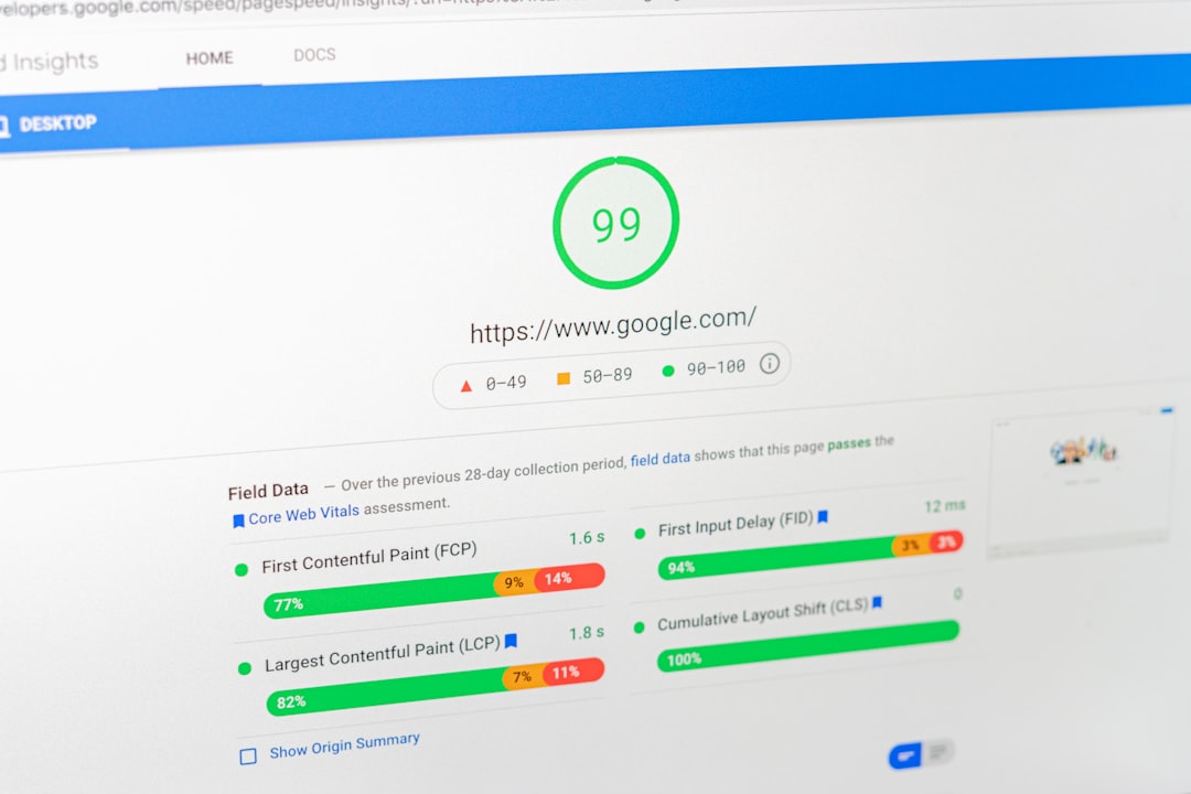
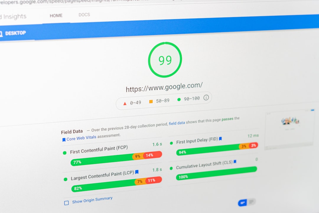
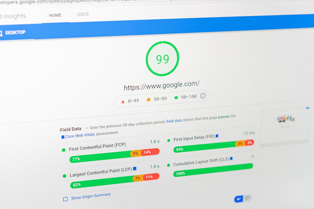
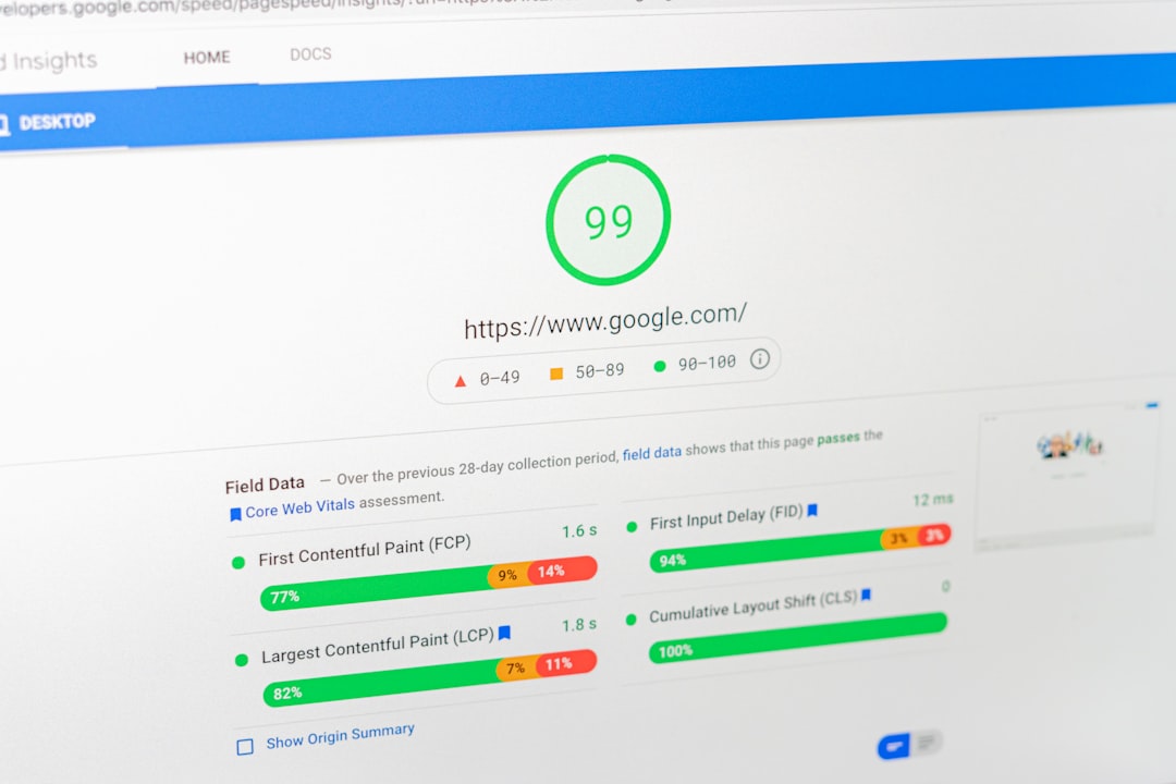
Test performance after making changes so you can see whether the optimization actually helped.
Make Text Easy to Read
Visitors should not need to zoom in to read your content.
Use readable font sizes, sufficient spacing, and short paragraphs. Break long sections into smaller blocks with descriptive headings.
This makes content easier to scan on a phone and can improve the overall user experience.
Optimize Navigation
Desktop navigation does not always translate well to mobile.
Your mobile menu should make important pages easy to find without taking up the entire screen.
Check whether visitors can quickly access:
- Main services
- Important categories
- Contact information
- Products
- Key resources
Avoid overly complicated menus with too many levels.
Make Buttons Easy to Tap
Links and buttons should have enough space around them to reduce accidental taps.
This is particularly important for:
- Contact buttons
- Forms
- Navigation controls
- Ecommerce actions
- Calls to action
Test buttons with an actual phone rather than relying only on a desktop browser preview.
Optimize Images for Mobile
Images should adapt to smaller screens without creating unnecessary page weight.
Do not upload a huge image simply because WordPress allows it.
Resize images appropriately, compress them, and use suitable formats where practical.
Also review how banners and background images appear on narrow screens.
Check Forms
Forms can become difficult to use on mobile when fields are too small or the layout is unnecessarily wide.
Test contact forms, newsletter forms, login pages, and checkout processes on a phone.
Make sure visitors can select fields, type information, and submit the form without frustration.
Avoid Intrusive Elements

Pop-ups, banners, and overlays can take over a small screen.
If you use them, make sure visitors can easily understand and close them. Important page content should remain accessible.
A mobile visitor should not have to fight through several overlays before reaching the information they came to find.
Improve Mobile Content Structure
Mobile screens make long blocks of text harder to read.
Use:
- Short paragraphs
- Clear headings
- Bullet points
- Useful tables where appropriate
- Descriptive links
Place the most important information where users can find it easily.
Test Your Website Regularly
Mobile optimization should be part of your regular SEO workflow.
Test important pages after:
- Theme updates
- Plugin updates
- Page redesigns
- New forms
- New pop-ups
- Major content changes
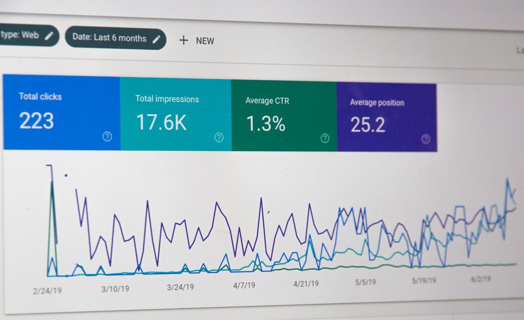
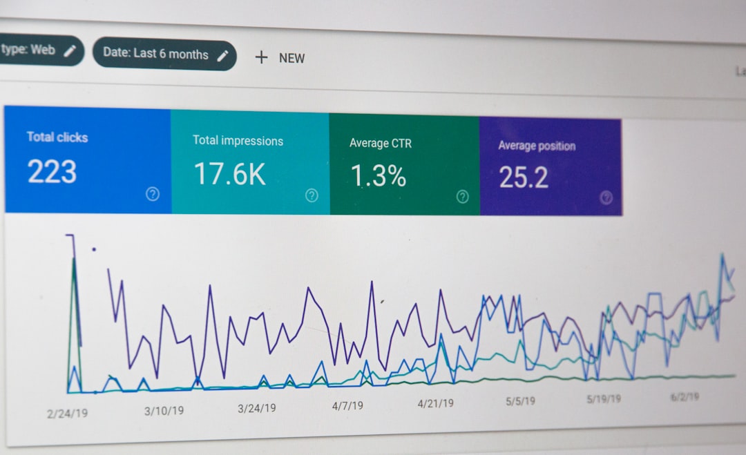
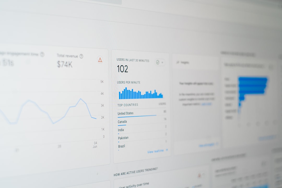
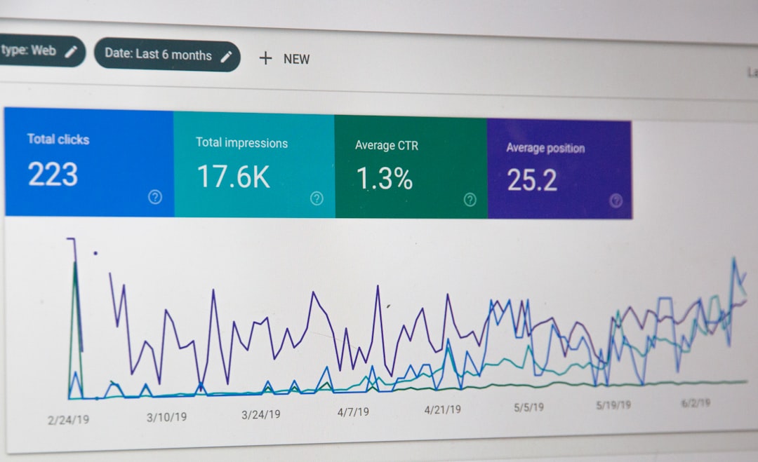
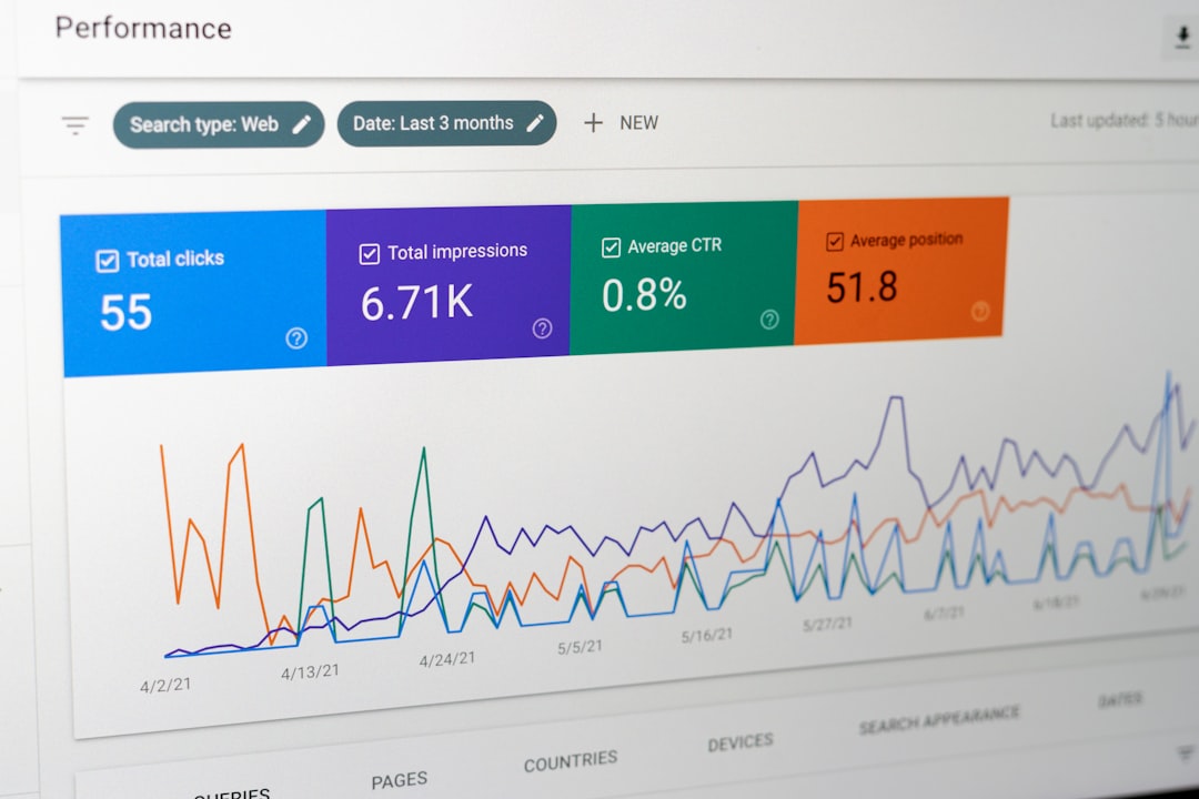
Google Search Console and other performance tools can also provide useful information about search visibility and website issues.
When Professional Help Is Useful
If your WordPress website has a complicated design, ecommerce functionality, custom page builder elements, or persistent mobile performance problems, professional SEO or technical support can help.
A WordPress SEO expert can review mobile usability alongside page speed, content structure, indexing, and overall search performance.
Mobile optimization is ultimately about removing friction. When visitors can quickly load, read, navigate, and interact with your website on a phone, you create a stronger experience for users while supporting the broader technical foundation of your WordPress SEO strategy.