A WordPress website needs to work well on mobile devices as well as desktop computers. Visitors may use smartphones to search for services, read articles, compare products, or contact a business.
Mobile optimization is therefore an important part of a complete WordPress SEO Consultant strategy.
Why Mobile Optimization Matters
A website that is difficult to use on a phone can create a poor user experience.
Common mobile problems include:
- Text that is too small
- Buttons that are difficult to tap
- Images extending beyond the screen
- Menus that do not work properly
- Slow-loading pages
- Crowded layouts
- Forms that are difficult to complete
A consultant can review these areas and identify practical improvements.
Test the Website on Different Screens

Do not assume that a website works well on mobile simply because it uses a responsive WordPress theme.
Test important pages on different screen sizes.
Pay attention to:
- Homepage
- Service pages
- Product pages
- Blog posts
- Contact forms
- Navigation
- Checkout pages where applicable
A page should remain usable without requiring visitors to zoom or scroll horizontally.
Improve Mobile Page Speed
Mobile users may have slower connections or less powerful devices than desktop users.
Large files can therefore create noticeable delays.
Review:
- Image sizes
- Unnecessary scripts
- Plugins
- Caching
- Hosting
- Page resources
Compressing images and removing unnecessary resources can help improve loading performance.
Optimize Images for Mobile
Images should be appropriately sized rather than uploading very large files and displaying them at a small size.
Useful practices include:
- Compressing images
- Using suitable image formats
- Choosing appropriate dimensions
- Writing descriptive alt text when useful
- Avoiding unnecessary decorative images
Image optimization can improve both page performance and usability.
Make Text Easy to Read
Visitors should not have to zoom in to read website content.
Check:
- Font size
- Line spacing
- Paragraph length
- Heading size
- Contrast
- Text spacing
Short paragraphs and clear headings can make longer pages much easier to read on mobile devices.
Improve Mobile Navigation

Navigation should be simple and easy to use.
Check whether visitors can quickly find:
- Main services
- Products
- Contact information
- Important categories
- Main website sections
Menus should not become difficult to use because of too many options or poorly arranged links.
Make Buttons Easy to Tap
Calls to action should be easy to interact with on a touchscreen.
Buttons such as:
Get a Quote
Contact Us
Book a Consultation
should have enough space around them to prevent accidental taps.
Important interactive elements should not be placed too close together.
Optimize Forms
Forms are often overlooked during mobile optimization.
Check whether users can:
- Select fields easily
- Type information comfortably
- See the entire form
- Understand required fields
- Submit without errors
A complicated form may discourage visitors even when the rest of the website works well.
Check Mobile Content
Mobile optimization does not mean hiding useful content simply to make the page shorter.
Important information should remain accessible.
Review whether:
- Key information appears early
- Headings are clear
- Important links are easy to find
- Content matches search intent
- Users can scan the page easily
The goal is to make content easier to consume, not simply reduce its length.
Review Mobile Technical SEO
A WordPress SEO Consultant may also check technical areas that affect mobile pages.
These can include:
- Mobile indexing
- Responsive design
- Page speed
- Redirects
- Canonical settings
- Structured content
- Crawlability
If a website has recently been redesigned, mobile testing should be part of the launch process.
Avoid Common Mobile Mistakes
Some common problems include:
Oversized Images
Large image files can slow down pages unnecessarily.
Tiny Text
Small text creates a poor reading experience.
Intrusive Elements
Pop-ups or other elements that cover important content can make pages difficult to use.
Broken Layouts
A desktop layout may not always translate properly to a smaller screen.
Difficult Navigation
Too many menu options can make finding information frustrating.
Use Performance Tools
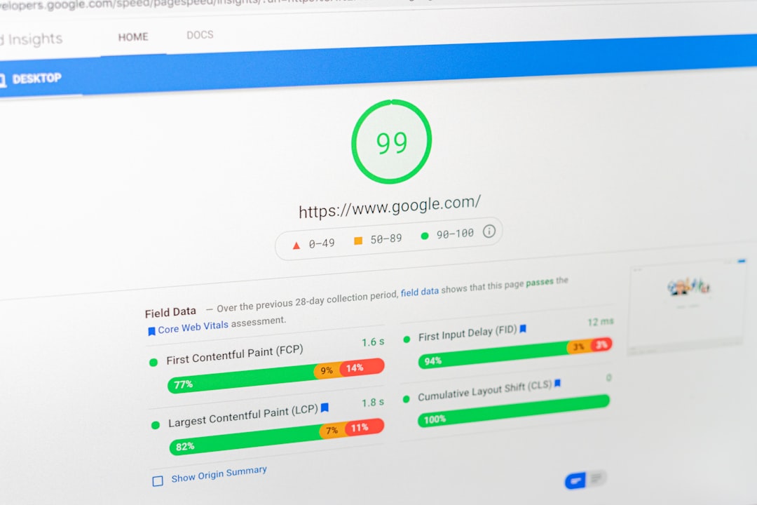
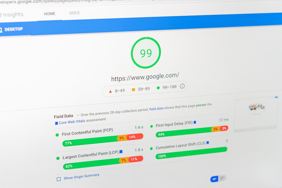
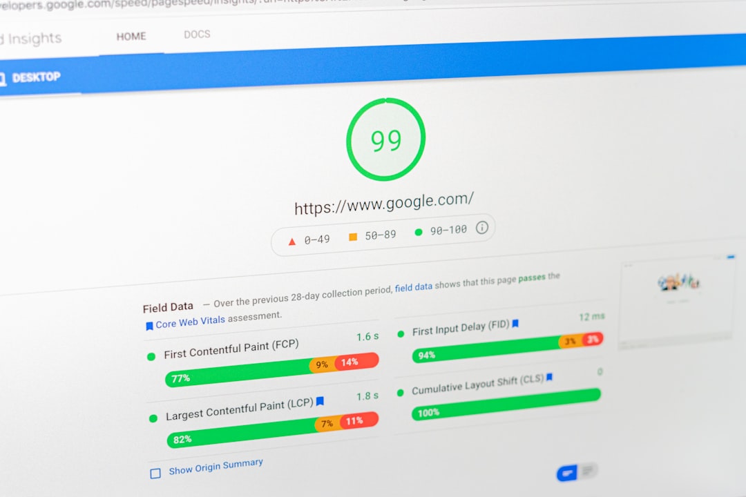
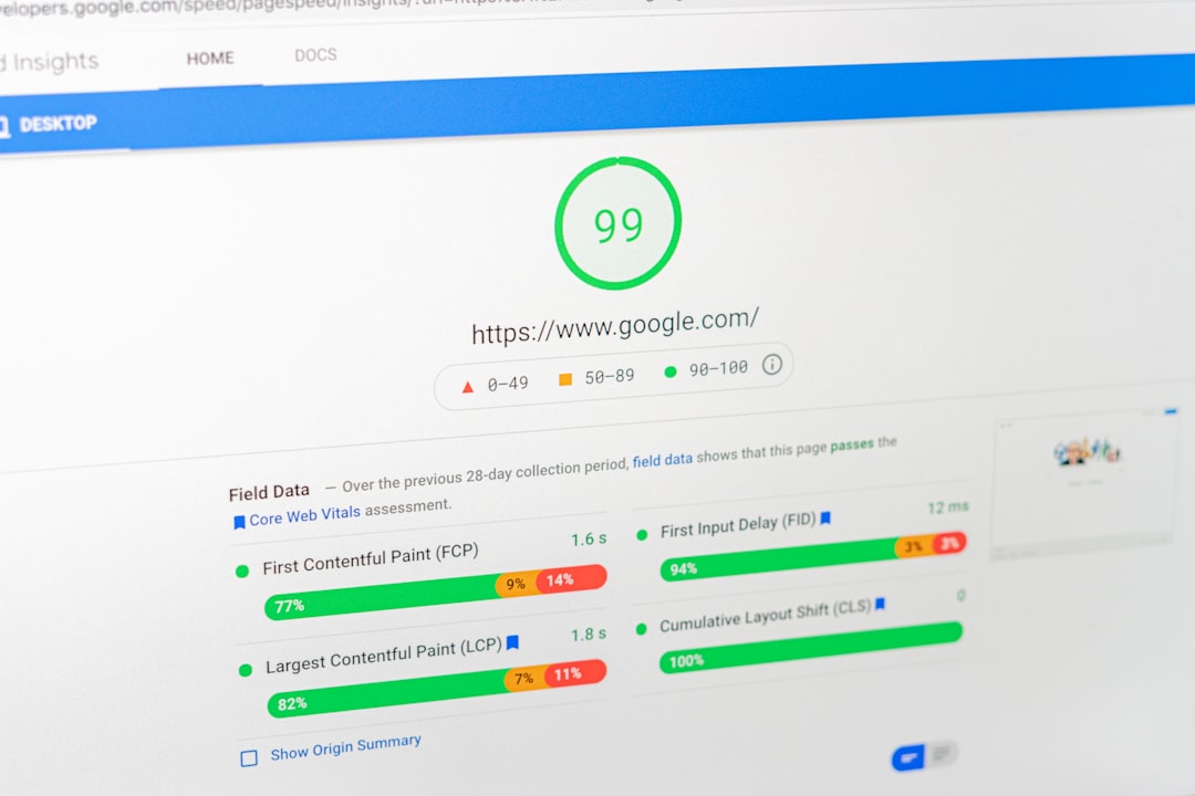
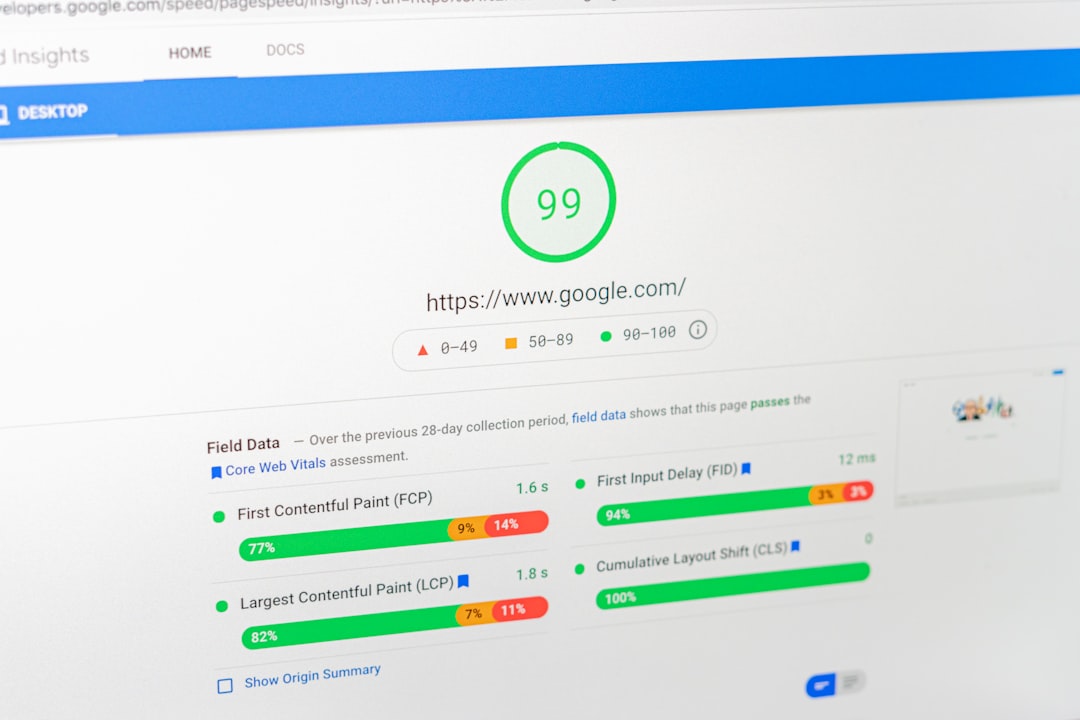
Tools such as PageSpeed Insights can provide information about mobile performance and potential improvements.
However, do not focus only on a numerical score. Real usability matters too.
A page should be fast, readable, functional, and easy to navigate.
Build Mobile Optimization Into SEO
Mobile optimization should not be treated as a separate task completed once.
Whenever new content, images, plugins, landing pages, or design changes are added, check how they behave on mobile.
A WordPress SEO Consultant can include mobile testing in the regular SEO workflow so that the website continues to provide a consistent experience across devices.