Mobile optimization is an important part of modern WordPress SEO. A website may look perfect on a desktop screen but become difficult to use on a smartphone if the layout, navigation, images, or content are not properly optimized.
A WordPress SEO agency can evaluate mobile performance as part of both technical SEO and user-experience optimization.
Why Mobile Optimization Matters

People use smartphones for everything from researching services to reading articles and making purchases.
If a page is difficult to use on a small screen, visitors may leave before finding the information they need.
Common mobile problems include:
- Tiny text
- Difficult navigation
- Oversized images
- Buttons that are hard to tap
- Horizontal scrolling
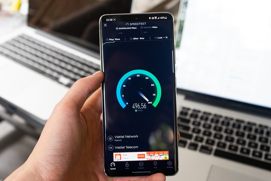
- Slow loading
- Crowded layouts
Use a Responsive WordPress Design
A responsive website automatically adapts its layout to different screen sizes.
Before choosing or updating a theme, check how it behaves on:
- Smartphones
- Tablets
- Laptops
- Large desktop screens
Do not judge responsiveness only from a desktop browser. Test important pages on actual mobile devices as well.
Improve Mobile Navigation
Navigation should be simple.
Visitors should be able to find important pages without opening several complicated menus.
A mobile navigation system should make it easy to reach:
- Home
- Services
- Products
- About
- Contact
- Important categories
Avoid overcrowding the menu with every available page.
Make Text Easy to Read
Mobile screens provide less space, so typography matters.
Use:
- Comfortable font sizes
- Clear headings
- Short paragraphs
- Adequate spacing
- Strong visual hierarchy
Large blocks of text can be difficult to read on a phone even when the information itself is useful.
Breaking content into smaller sections makes it easier to scan.
Optimize Images
Large images are one of the common causes of slow pages.
Before uploading images:
- Resize them to an appropriate display size.
- Compress them.
- Use a suitable modern format where possible.
- Avoid uploading unnecessarily huge files.
Also make sure images do not extend beyond the mobile screen.
Improve Mobile Page Speed
A fast mobile experience requires more than image compression.
Review:
- Hosting
- Caching
- Plugins
- JavaScript
- CSS
- Third-party scripts
- Large page elements
Remove unnecessary elements instead of simply adding more optimization tools.
Make Buttons Easy to Use
Calls to action should be easy to tap.
For example:
Request a Quote
Contact Us
Book a Consultation
Buttons should have enough space around them so users do not accidentally tap another element.
Check Forms on Mobile
Forms that work well on desktop can become frustrating on smartphones.
Test:
- Field sizes
- Labels
- Dropdowns
- Error messages
- Submit buttons
- Keyboard behavior
Keep forms as simple as possible and only request information that is genuinely necessary.
Review Mobile Content
Mobile users may scan content quickly.
Important information should appear clearly near the relevant sections.
Use:
- Descriptive headings
- Bullets
- Short paragraphs
- Tables only when they remain usable on small screens
- Clear calls to action
Do not hide important content simply because mobile screens are smaller.
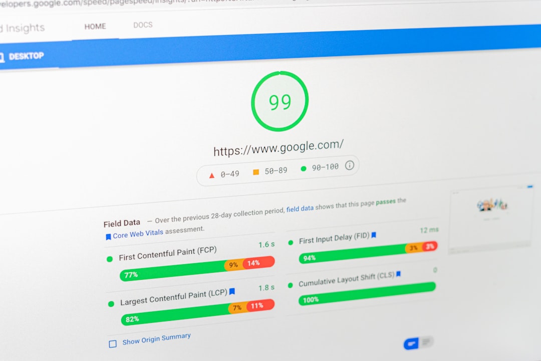
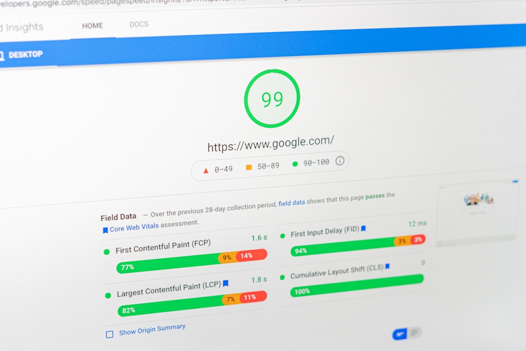
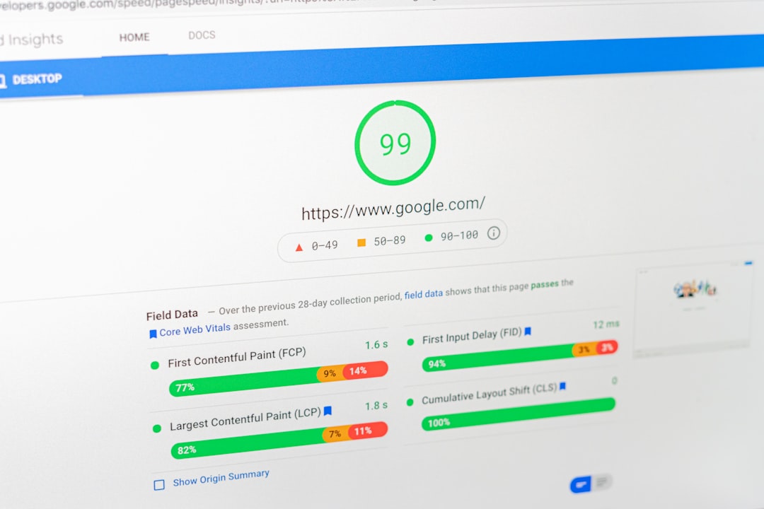
Monitor Core Web Vitals
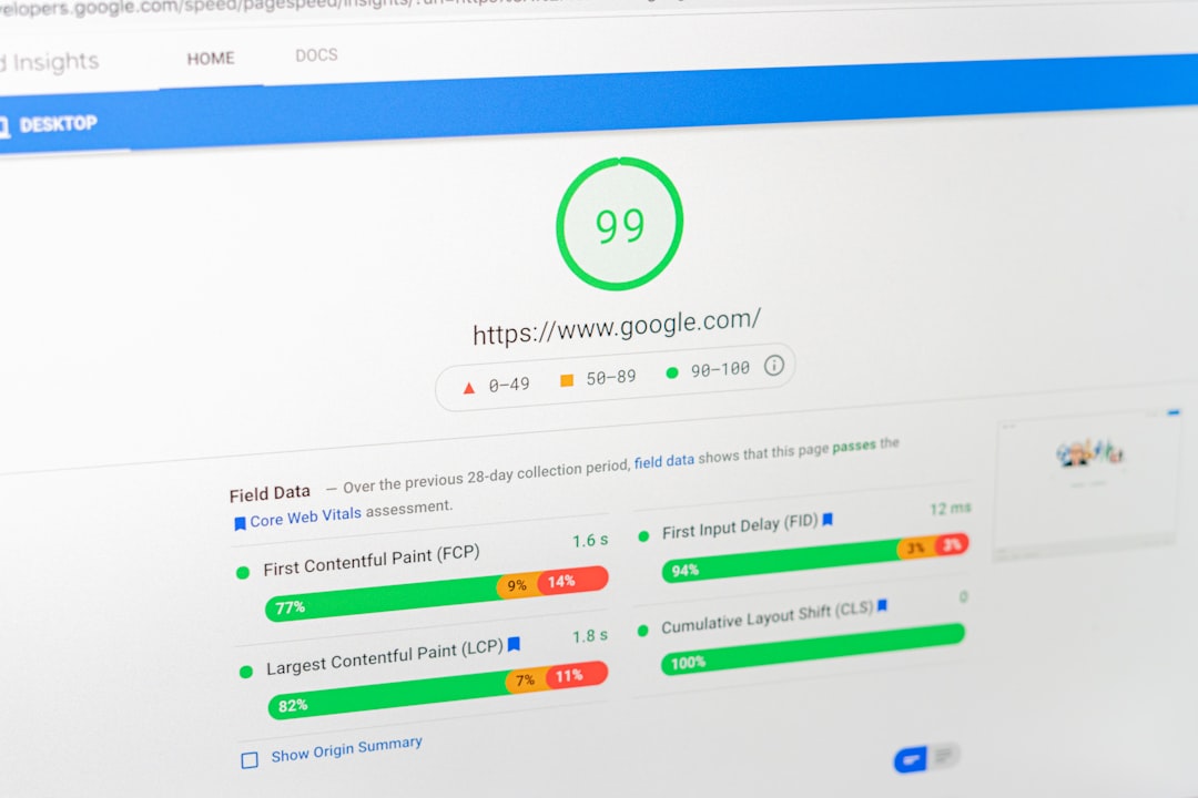
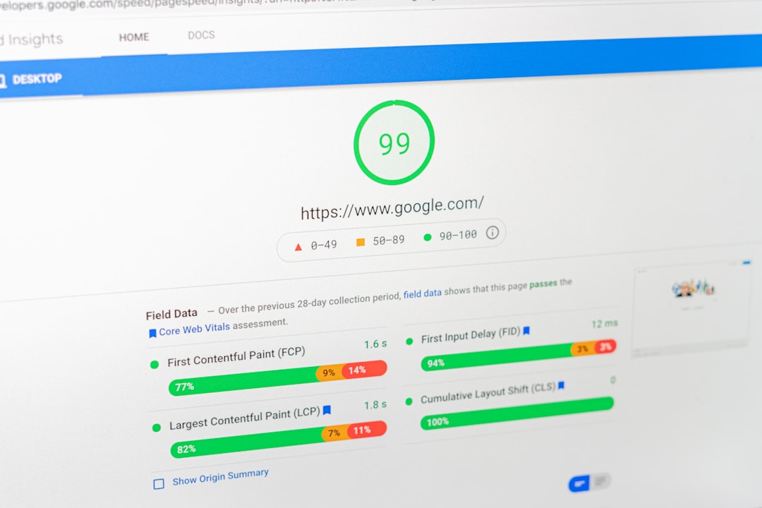
Performance can be evaluated using relevant page-experience metrics.
Review areas such as:
- Loading performance
- Interactivity
- Visual stability
Do not optimize for a score alone. The actual goal is to make pages faster, more stable, and easier to use.
Test After Website Changes

Mobile problems can appear after:
- Theme updates
- Plugin changes
- New page-builder elements
- Website redesigns
- New scripts
- Image changes
After major updates, revisit important pages on mobile devices.
Build Mobile Optimization Into SEO
Mobile optimization should not be a one-time task.
A practical workflow is:
Test → Identify Problems → Optimize → Re-test → Monitor
A WordPress SEO agency can include these checks in regular technical audits, helping ensure that mobile usability remains strong as the website grows.