Mobile SEO problems on WordPress usually come from a stack of smaller issues, not one missing plugin. Slow templates, oversized images, layout shifts, and weak internal linking compound until rankings stall on phones. This guide focuses on the fixes that tend to move the needle first, especially if your site looks fine on desktop but underperforms on mobile.
Google now crawls and indexes most sites with a smartphone crawler, so your mobile version needs the same core content, metadata, and usability as desktop. Mobile performance also matters because Core Web Vitals are part of Google’s page experience signals, even though they are not the whole ranking story. If you want a second set of eyes before changing settings, review our WordPress site speed fixes for SEO and our WordPress SEO strategy for small business.
Start with mobile indexing, not plugin scores
The direct answer is this: mobile SEO starts with making sure Google sees a complete, usable mobile version of your site. A green score inside an SEO plugin does not prove that your pages load well, render well, or satisfy search intent on a phone.
Check your most important pages on an actual smartphone, then compare them with desktop. Your headings, body copy, structured data, internal links, images, and calls to action should all be available on mobile. If content is hidden, cut off, or removed for smaller screens, that can weaken both user experience and search visibility. WordPress SEO Expert often finds that “mobile SEO issues” are really mobile content and template issues.
Fix page speed where mobile users feel it

Page speed matters most when slow loading blocks the main content or frustrates phone users before they can engage. The practical goal is not a perfect test score. The goal is faster rendering of the page elements people actually see and use first.
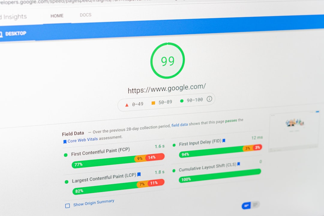
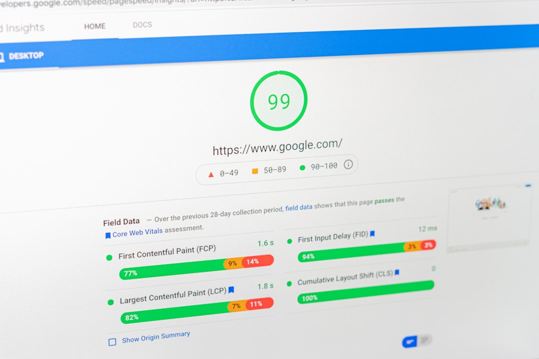
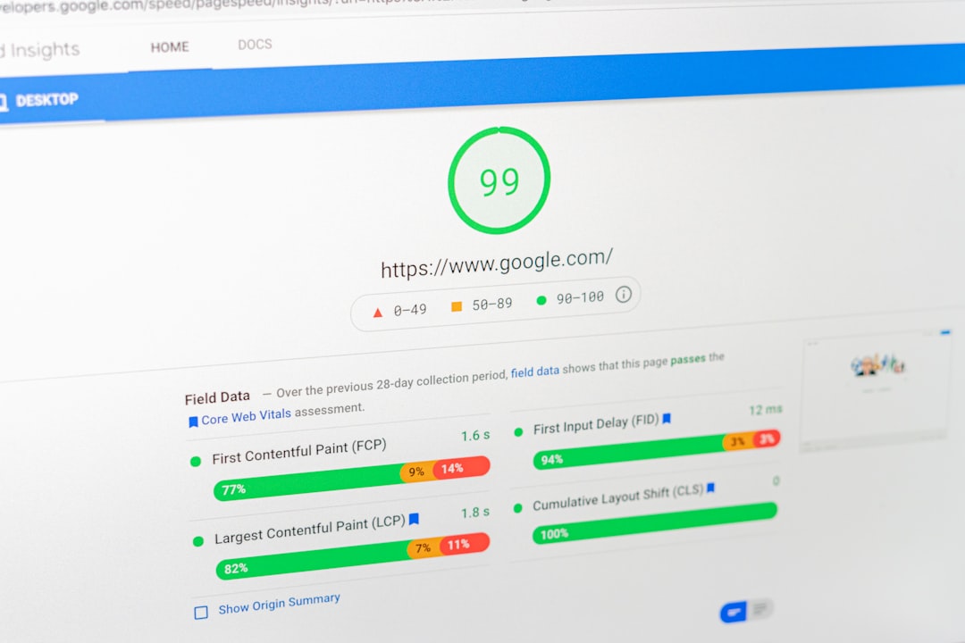
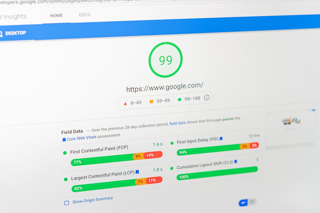
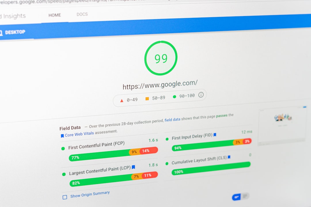
Use PageSpeed Insights to review mobile performance and separate lab data from real-world data. Focus on Largest Contentful Paint, Cumulative Layout Shift, and Interaction to Next Paint before you chase minor recommendations. Google’s own documentation makes it clear that good scores do not guarantee top rankings, but poor page experience can still hold back otherwise solid pages.
For WordPress sites, the most common mobile speed wins are compressing oversized images, reducing unnecessary JavaScript, improving caching, and removing bloated plugins that load assets sitewide. If your homepage still loads a giant hero image and three sliders on mobile, that is a more urgent fix than tweaking metadata.
What to prioritize first
| Area | What to check | Why it matters on mobile |
|---|---|---|
| Images | Large hero images, missing compression, wrong dimensions | Heavy images often delay the main content users see first |
| Scripts | Page builders, sliders, chat widgets, extra tracking tags | Too much JavaScript can slow rendering and interaction |
| Caching | Page caching, browser caching, CDN setup | Weak caching raises load times on slower connections |
| Layout | Shifting buttons, unstable banners, image placeholders | Layout jumps create a poor tap experience |
| Theme output | Hidden content, oversized sections, intrusive popups | Mobile templates can block usability even when desktop looks fine |
Optimize images for smaller screens
Image optimization is often the fastest mobile SEO improvement on WordPress. Mobile visitors do not need desktop-sized files, and oversized media frequently drags down load time more than site owners realize.
WordPress has supported native lazy loading for images since version 5.5, and that helps reduce unnecessary loading below the fold. Just make sure your theme outputs width and height attributes correctly, because unstable image space can contribute to layout shift. On pages where the main hero image is the largest visible element, be careful not to delay the image that should load first.
A simple rule works well here: compress large images before upload, avoid decorative sliders, and use properly sized featured images for mobile layouts. Most site owners do not need more image variety. They need fewer oversized files.
Keep mobile layouts simple and readable

Mobile SEO improves when visitors can read, scroll, and tap without friction. If your mobile page forces pinching, stacks giant design elements before the content, or buries internal links under accordions, the problem is layout quality, not just optimization.
Review your font sizes, line spacing, button spacing, sticky headers, and popup behavior. Long pages are not automatically bad on mobile, but cluttered ones are. Keep the main heading clear, move the useful content higher on the page, and make sure your primary call to action does not block the text or the navigation.
Google also recommends that pages display well on mobile devices and avoid intrusive interstitials. That matters for lead generation sites that use aggressive popups, coupon overlays, or email gates that cover the page before the visitor can even read the introduction.
Tighten internal linking for mobile users
Internal linking still matters on mobile, but it has to be easy to use with a thumb. Mobile visitors are less likely to hunt through crowded sidebars or tiny footer links, so the best internal links are usually placed directly inside the body content.
Use descriptive anchor text that helps users take the next step. For example, if a reader is diagnosing technical issues, point them to our real WordPress speed fixes for SEO. If they need a broader roadmap, link naturally to our small business WordPress SEO strategy. This helps visitors, distributes relevance across the site, and reduces the chance that important pages become isolated.
If you’re experiencing these symptoms, our team at WordPress SEO Expert can help.
Use a mobile SEO checklist in the right order
The right sequence is simple: fix crawl and content parity first, then speed, then layout friction, then on-page refinements. That order prevents you from wasting time on minor SEO settings while the mobile experience still feels broken.
| Priority | Fix this first | What success looks like |
|---|---|---|
| 1 | Confirm mobile pages contain the same important content and metadata as desktop | Google and users can access the full page on phones |
| 2 | Reduce heavy images, scripts, and plugin bloat | Important pages load faster and feel responsive |
| 3 | Clean up layout shifts, intrusive popups, and tap-target issues | Visitors can read and interact without frustration |
| 4 | Improve titles, headings, and internal links | Pages are clearer, easier to scan, and better connected |
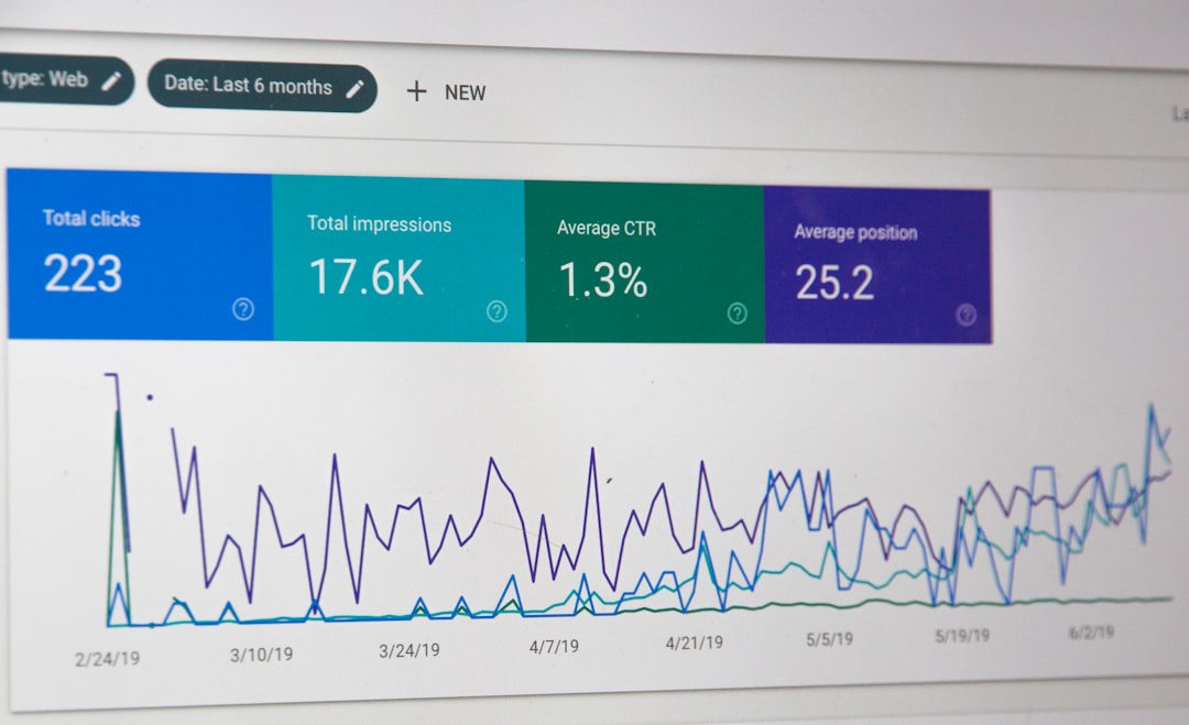
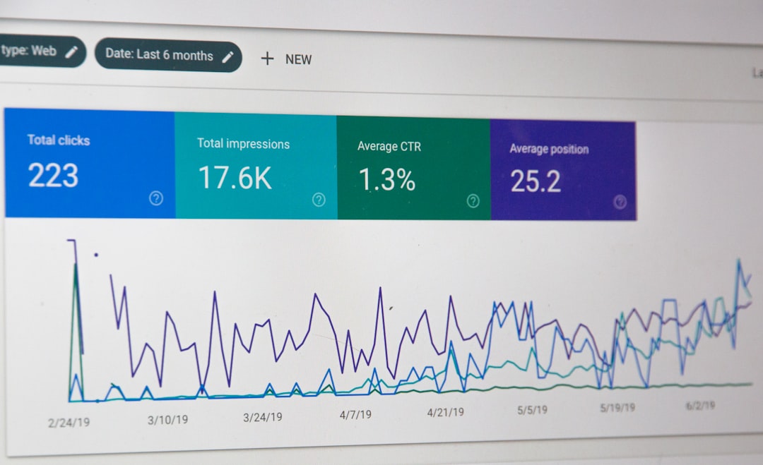
| 5 | Measure results in Search Console and PageSpeed Insights | You can see whether fixes improved real page performance |
Do not treat mobile SEO as a separate site
The best mobile SEO setup is usually the one with the fewest moving parts. Responsive design, clean templates, one solid SEO plugin, and restrained use of third-party widgets usually outperform complicated workarounds.
This is where many WordPress sites go sideways. Owners add multiple optimization plugins, mobile plugins, popup tools, font loaders, and tracking scripts until the site becomes harder to maintain and slower on phones. One clean setup is usually better than a stack of overlapping tools all trying to solve the same issue.
Final takeaway
WordPress mobile SEO works best when you solve the actual bottlenecks in order. Start with mobile-first content parity, improve speed where users feel it, simplify layouts, and strengthen body-level internal links. Most sites do not need a complicated overhaul. They need a cleaner, faster mobile experience on the pages that matter most.
Contact WordPress SEO Expert today to schedule a consultation. We can help you identify what is really holding back your mobile rankings before you spend more time changing settings that do not matter.