
Mobile SEO problems on WordPress usually come from a scattered setup, not one missing plugin. If your rankings are weaker on phones than they should be, the fix is rarely a new tool. It is a cleaner mobile experience, stronger content parity, and fewer technical conflicts getting in the way.
Google now crawls and indexes almost all websites with a smartphone crawler, which means your mobile version carries the SEO weight. Google also recommends keeping the same important content, links, metadata, and structured data across desktop and mobile versions. That is why mobile SEO should be treated as a core visibility issue, not just a design cleanup task. Google explains the move to smartphone crawling, and its earlier guidance also stresses content and metadata parity between mobile and desktop.
If you want a broader diagnostic baseline first, review our WordPress SEO checklist for business sites and our WordPress mobile SEO checklist. Those guides pair well with the mobile optimization priorities below.
What matters most in WordPress mobile SEO?
The short answer is this: fix the issues that block visibility before the issues that polish visibility. Most site owners do not have one catastrophic mobile SEO problem. They have several smaller issues that combine into slower pages, weaker crawl signals, and a more frustrating experience on phones.
A green light in an SEO plugin does not mean the page deserves to rank. One well-configured SEO plugin is enough. Running overlapping plugins often creates duplicate metadata, conflicting canonicals, and competing sitemap outputs. Mobile SEO works better when the setup is simpler and the priorities are clearer.
How to optimize WordPress SEO for mobile
Start with the version users and Google actually see on a phone. The goal is not a perfect test score. The goal is a site that loads cleanly, keeps important content visible, and makes it easy for users to move to the next step.
1. Keep mobile content equal to desktop content
If the mobile page hides core copy, internal links, or schema, Google has less to evaluate and users have less to act on. Google’s mobile-first indexing guidance recommends that the content shown on mobile and desktop stay the same, including text, images, videos, links, metadata, and structured data. Google states this directly in its mobile-first indexing guidance.
This is a common problem on WordPress sites using builders, tabs, accordions, or mobile-specific templates. If a page explains the service well on desktop but removes half the useful content on mobile, rankings can flatten for reasons that have nothing to do with keyword usage.
2. Reduce image weight near the top of the page
Large hero images often slow the first mobile screen more than site owners realize. Focus first on homepage banners, featured images, and full-width media near the top of important templates. You do not need to optimize every image on the site before seeing gains.
Prioritize the pages that drive leads, sales, or impressions. Resize oversized uploads, compress older assets, and confirm your theme serves appropriately sized images on smaller screens. Mobile speed work is most useful when it is tied to the pages that matter most.
3. Use Core Web Vitals as the baseline
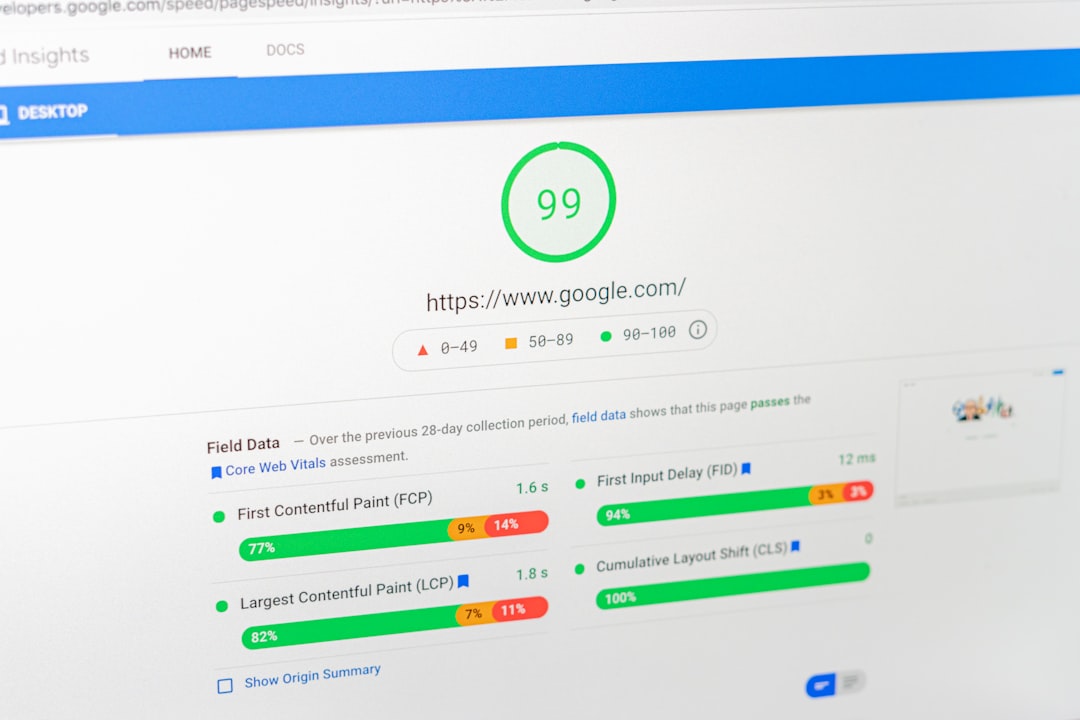
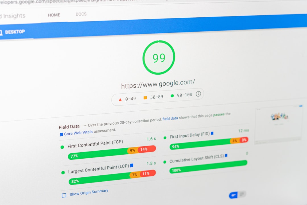
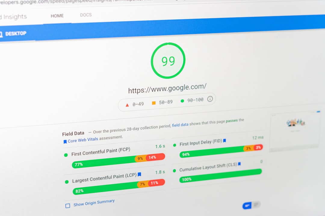
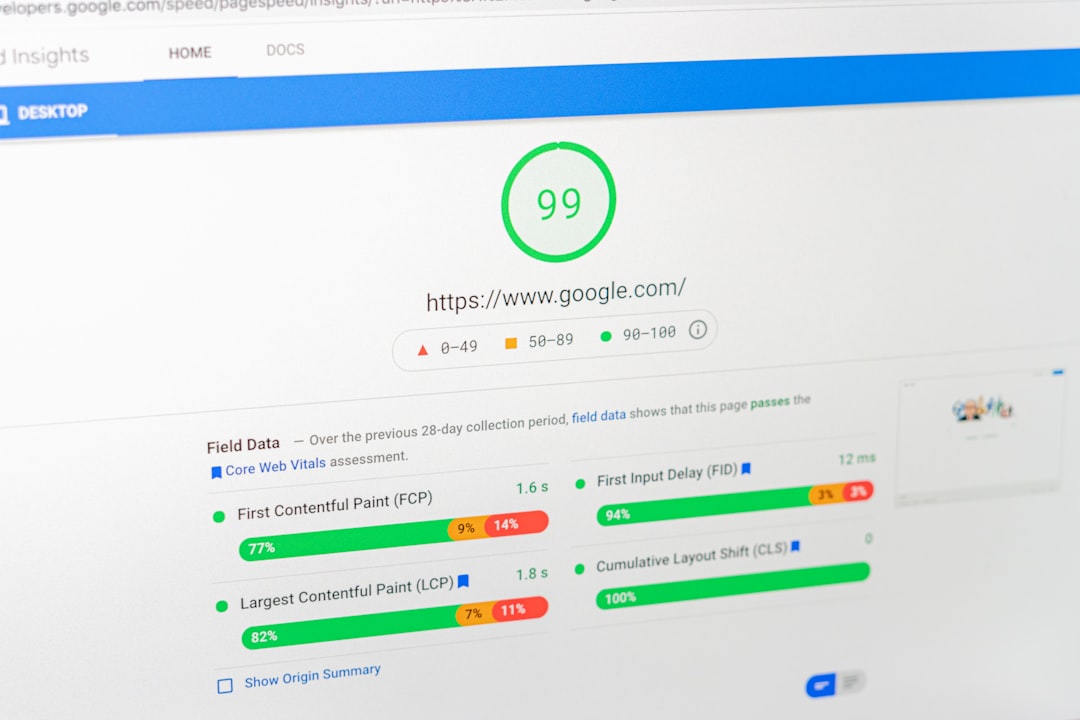
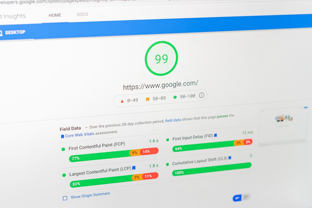
Core Web Vitals are a better mobile benchmark than plugin badges. Google says PageSpeed Insights combines lab and real-world data where enough field data exists, and Google recommends aiming for LCP within 2.5 seconds, INP under 200 milliseconds, and CLS under 0.1 for a good user experience. Google’s PageSpeed Insights documentation explains the data sources, and Google’s Core Web Vitals documentation lists the recommended thresholds.
If those numbers are already in reasonable shape, your next gains may come from better targeting, cleaner templates, or stronger internal linking rather than endless speed tuning. That is a better use of time than chasing a perfect score.
4. Cut front-end plugin and theme bloat
Slow mobile pages are often a plugin stack problem, not a WordPress problem. Sliders, chat widgets, review carousels, popup tools, tracking scripts, and page builder assets can all compete for the same small mobile screen and limited device resources.
Review what loads on each template and ask a blunt question: does this feature need to load here? A contact form script does not need to run across every blog post. A homepage animation does not need to follow users onto service pages. If you are experiencing these symptoms, our team at WordPress SEO Expert can help.
5. Improve mobile title tags
Title tags still matter on mobile, but cluttered titles waste limited screen space. Google recommends writing descriptive, concise title text and warns against keyword stuffing and repetitive boilerplate. Google’s title link documentation outlines these title best practices.
Put the main topic first, then add a short qualifier only if it clarifies the page. Most WordPress pages do better with one clear promise than with several near-duplicate keyword variations packed into the title.
| Weak title | Stronger title |
|---|---|
| SEO Optimization | SEO Help | SEO Services | WordPress Mobile SEO Optimization |
| Mobile SEO for WordPress Website Optimization Guide | How to Improve Mobile SEO on WordPress |
| Best Mobile SEO Optimization WordPress Services | Mobile SEO Fixes for WordPress Sites |
6. Make internal links usable on mobile
Internal links should still be visible, descriptive, and easy to tap on a phone. Google recommends anchor text that is descriptive, reasonably concise, and relevant to the destination page. Google covers this in its link best practices documentation.
Do not remove useful internal links from mobile layouts just to make the design look cleaner. Keep fewer links if needed, but make them better. If you are tightening your site structure, our WordPress SEO checklist for business sites and WordPress mobile SEO checklist will help you prioritize the next steps.
7. Test the real mobile experience


A page can be indexable and still perform poorly if the actual phone experience is awkward. Menus, forms, sticky bars, popups, and tap targets should be tested on real devices, not just inside a desktop browser preview.
If users have to pinch, re-tap, scroll past overlays, or fight a shifting header before they can contact you, the page needs simplification. Mobile SEO and mobile usability overlap more than most site owners expect.
What should you stop doing?
Stop treating plugin scores as proof of optimization. A green light does not confirm that the page is fast enough, useful enough, or targeted well enough to rank. It only confirms that a tool liked a limited checklist.
Also stop stacking SEO plugins, publishing thin near-duplicate posts, and making mobile design changes without checking the search impact. Cleaner systems usually outperform more complicated ones because they send fewer mixed signals.
When should you get professional help?
If you have already compressed images, removed obvious plugin bloat, and checked mobile content parity but rankings are still flat, the problem may be broader than speed alone. Indexing, duplication, weak page targeting, and internal linking often overlap with mobile SEO problems.
WordPress SEO Expert can review your setup and show you what is actually holding the site back. Book a free SEO consultation. No pitch, no pressure. Just an honest look at what your site actually needs and whether your current setup is part of the solution or part of the problem. Contact WordPress SEO Expert today to schedule a consultation.