Low rankings on phones usually come from a scattered setup, not one missing plugin. If your site feels slow, hides important content on mobile, or loads too many theme and plugin assets, a mobile SEO checklist helps you fix the issues that block visibility before the issues that only polish it.
For most WordPress sites, the right goal is not a perfect plugin score. It is a mobile experience that loads cleanly, keeps the same important content across devices, and makes it easy for users to reach the next step. If you need broader background first, review these WordPress SEO best practices and our guide to WordPress mobile SEO optimization.
What should you check first for mobile SEO?
Start with the problems that hurt crawling, speed, and usability at the same time. Google now crawls and indexes almost all sites with a smartphone crawler, which means your mobile version is the version that matters most for search evaluation.
That changes the order of operations. Before rewriting copy or chasing plugin suggestions, confirm that your mobile pages keep the same core text, internal links, metadata, and structured data as desktop. Google also recommends descriptive, concise titles and warns against keyword stuffing and repetitive boilerplate in title elements.
| Priority | What to review | Why it matters |
|---|---|---|
| 1 | Mobile content parity | Missing text, links, or schema weakens what Google can evaluate |
| 2 | Large above-the-fold images | Heavy images slow the first screen and often drag down LCP |
| 3 | Theme and plugin scripts | Extra front-end code delays rendering and interaction |
| 4 | Tap targets and popups | Mobile friction reduces usability and often conversion rates |
| 5 | Layout shifts | Unstable headers, images, and banners create accidental taps |
Use Core Web Vitals as your baseline

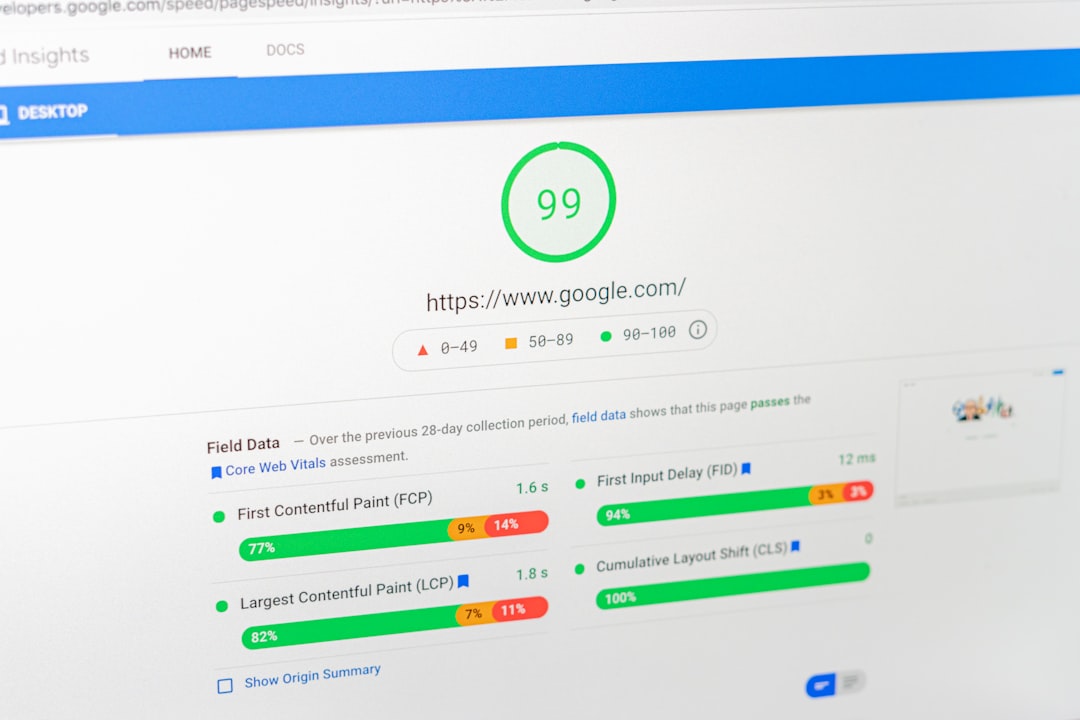
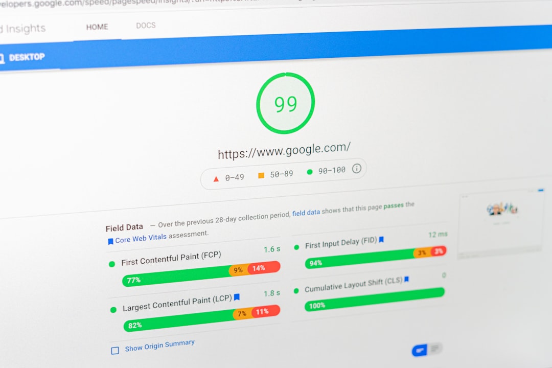
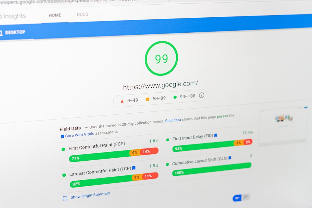
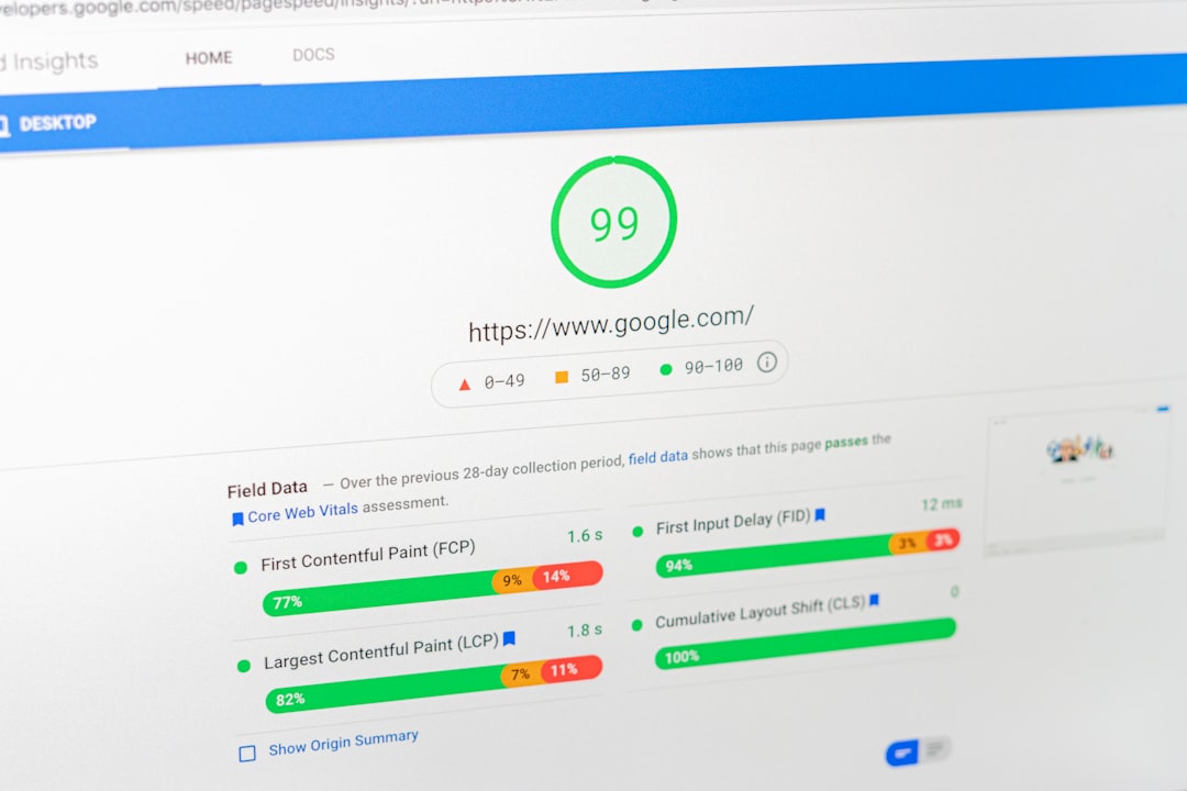
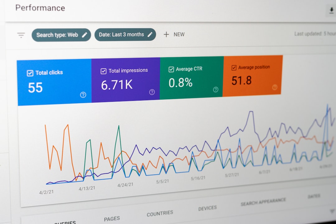
The cleanest mobile baseline is Core Web Vitals, not a plugin badge. Google’s PageSpeed Insights documentation explains that PSI combines Lighthouse lab data with Chrome UX Report field data when enough real-user data exists.
A practical benchmark is simple: aim for LCP under 2.5 seconds, CLS under 0.1, and INP under 200 milliseconds on important templates. If those numbers are already in a good range, your next gains may come faster from stronger page targeting and internal links than from more speed tuning.
Your WordPress mobile SEO checklist
Use this checklist in order. Most site owners do not have one catastrophic problem. They have a stack of smaller issues that compound over time, so the goal is to remove the highest-friction blockers first.
1. Check that mobile content matches desktop
The mobile version should not be a stripped-down version of your page. Important headings, service copy, internal links, images, metadata, and structured data should stay consistent across devices.
This is where page builders, tabs, accordions, and mobile-only layouts quietly create SEO problems. If the desktop page explains the service clearly but the phone version hides half the text and key links, you are giving Google less to crawl and users less to act on.
2. Reduce image weight on key pages
Oversized images are still one of the most common mobile SEO problems on WordPress. Start with hero images, homepage banners, featured images, and any full-width media near the top of the page.
Replace desktop-scale images that mobile users do not need, compress older uploads, and confirm your theme is serving appropriately sized images. You do not need to tune every asset on the site before you see results. Start with the templates that drive leads, sales, or the most impressions.
3. Audit front-end plugin and theme bloat
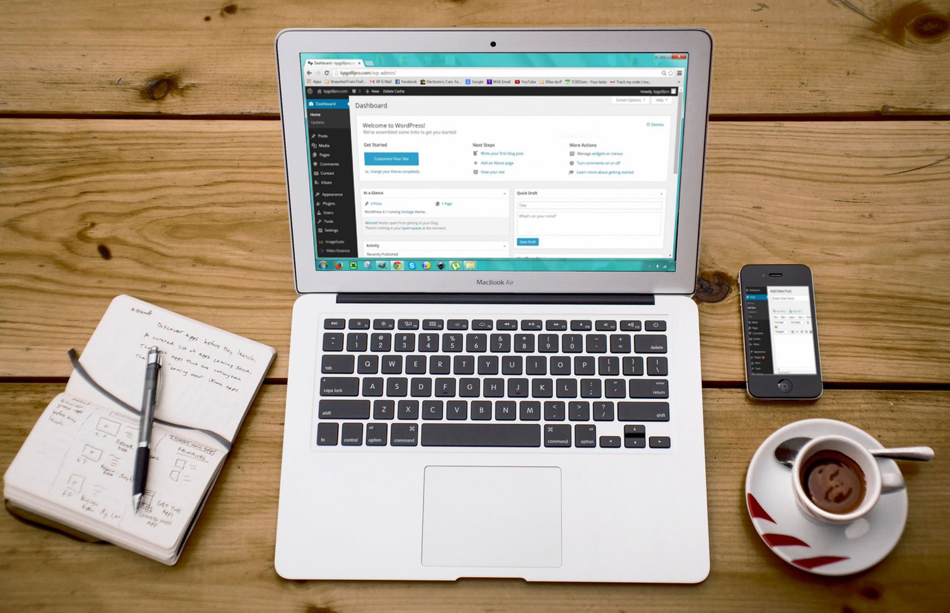
Most slow mobile pages are not slow because WordPress itself is the problem. They are slow because sliders, chat widgets, popups, review carousels, tracking tools, and builder scripts all load together.
Review what loads on the front end and ask a blunt question: does this feature need to load on this page? A contact form plugin does not need to load across every post. A homepage animation does not need to load on every service page. One well-configured SEO plugin is enough. Running overlapping plugins often creates duplicate metadata, conflicting canonicals, and competing sitemap outputs.
4. Test menus, buttons, forms, and sticky elements on a real phone

Mobile usability affects SEO indirectly because frustrating pages do not perform as well with users. A page can be technically indexable and still lose momentum if forms are awkward, menus are cluttered, or sticky elements consume too much screen space.
Test your navigation, phone number links, lead forms, checkout steps, and CTA buttons on an actual device. If users have to pinch, re-tap, or dismiss multiple overlays before they can act, simplify the experience. If you are seeing these symptoms, our team at WordPress SEO Expert can help.
5. Review title tags and mobile SERP readability
Titles still matter on mobile, but cluttered titles waste limited screen space. Google recommends writing title text that is descriptive and concise rather than repetitive or stuffed with keyword variations.
Use the main topic first, then add a short qualifier if it helps. Keep the promise clear enough that a mobile searcher can understand the page at a glance.
| Weak title | Stronger title |
|---|---|
| SEO Checklist | SEO Tips | SEO Help | WordPress Mobile SEO Checklist |
| Mobile SEO for WordPress Site Optimization Guide | Mobile SEO Fixes for WordPress |
| Best WordPress SEO Mobile Optimization Services | How to Improve Mobile SEO on WordPress |
6. Confirm internal links are visible and useful on mobile
Internal links should help users and search engines move naturally through the site. Google’s link guidance recommends anchor text that is descriptive, concise, and relevant to the destination page.
Check that related links are not removed from mobile layouts just to save space. A cleaner approach is to keep fewer, more useful links on the page. If you are tightening your overall structure, the earlier guide on WordPress SEO best practices is a good next step.
7. Watch for layout shifts and unstable page elements
Layout instability is usually a template problem, not a content problem. If headers resize, banners inject late, or images load without reserved space, mobile visitors end up tapping the wrong thing.
Reserve space for images and embeds, keep announcement bars under control, and avoid stacking multiple sticky elements on small screens. You do not need a perfect score. The goal is a site that loads cleanly and is easy to use.
What should you stop doing?
Stop treating green plugin lights as proof a page is optimized. A green light does not mean the page deserves to rank, and it does not tell you whether the mobile experience is actually helping users.
Also stop stacking SEO plugins, publishing thin near-duplicate posts, and making design changes without testing the mobile output. A simpler setup with cleaner templates usually beats a more complicated stack.
When should you get help?
If you have already compressed images, cleaned up plugins, and checked mobile content parity but rankings still feel stuck, the issue may be larger than speed alone. Indexing, internal linking, and search intent alignment often overlap with mobile performance problems.
WordPress SEO Expert can review your setup, identify what is actually holding the site back, and help you prioritize the fixes that matter first. Contact WordPress SEO Expert today to schedule a consultation. No pitch, no pressure. Just an honest look at what your site actually needs and whether your current setup is part of the solution or part of the problem.