
Low rankings on phones usually come from a scattered setup, not one missing plugin or one bad speed score. Mobile SEO in WordPress works best when you fix the issues that block visibility first: responsive layout, crawlable content, usable templates, and clean performance on real devices.
Google uses mobile-first indexing, which means the mobile version of your site is the starting point for indexing and evaluation. If your phone layout hides important content, strips metadata, or creates a clumsy experience, your rankings can stall even when the desktop version looks fine.
This is where most WordPress sites go sideways. They spend time chasing plugin lights and homepage scores while product pages, service pages, and blog templates still have cramped layouts, weak internal linking, or slow interactions on mobile. For a broader foundation, review our WordPress SEO best practices and our comparison of Yoast SEO vs Rank Math before you change plugin settings.
What mobile SEO means in WordPress
Mobile SEO in WordPress means making sure your site is easy for Google to crawl and easy for visitors to use on smaller screens. The direct goal is not a perfect audit score. The goal is a mobile site that preserves content, loads cleanly, and helps users complete the next step.
That includes responsive templates, readable text, stable layouts, tap-friendly navigation, compressed images, restrained plugin usage, and metadata that stays consistent across devices. Google recommends responsive web design and also advises that the mobile version should keep equivalent primary content, title elements, and meta descriptions.
What to fix first
Fix the issues that block visibility before the issues that polish visibility. If your mobile pages are hard to crawl, missing key content, or frustrating to use, better copywriting and schema tweaks will not carry as much weight.
| Priority | What to check on mobile | Why it matters |
|---|---|---|
| 1 | Responsive layout and viewport setup | Prevents broken rendering and content that spills off screen |
| 2 | Equivalent content and metadata | Keeps Google from seeing a thinner mobile version |
| 3 | Navigation, buttons, and form usability | Improves engagement and reduces friction on small screens |
| 4 | Image weight and template speed | Helps pages load faster on weaker connections |
| 5 | Internal linking from mobile templates | Supports discovery and clearer site structure |
| 6 | Plugin overlap and script bloat | Reduces conflicts and slow interactions |
1. Make sure the mobile version contains the real content
Your mobile pages should contain the same core content and signals that matter on desktop. If a theme collapses key copy, strips headings, removes internal links, or hides media and structured sections, Google may evaluate a weaker version than you expect.
This problem shows up often after redesigns, page builder changes, and aggressive mobile simplification. Tabs and accordions are fine when they preserve equivalent information. The issue is not layout differences. The issue is publishing a thinner mobile experience and assuming Google will rely on the desktop version instead.
2. Use responsive design, not separate mobile shortcuts
Responsive design is usually the safest path for WordPress mobile SEO because it keeps one URL and one content set while adapting presentation to screen size. That reduces maintenance problems, duplicate handling, and metadata mismatches between device versions.
If you are using an older setup with separate mobile URLs or heavy device-based content changes, review it carefully. Responsive themes, a correct viewport tag, and consistent templates usually create fewer SEO headaches than custom mobile workarounds.
3. Improve speed where mobile users actually feel it
Mobile performance matters most when slow templates make pages hard to use. The practical focus should be heavy images, unstable layouts, excess JavaScript, and slow interaction handling on key templates, not endless tweaking for a vanity score.
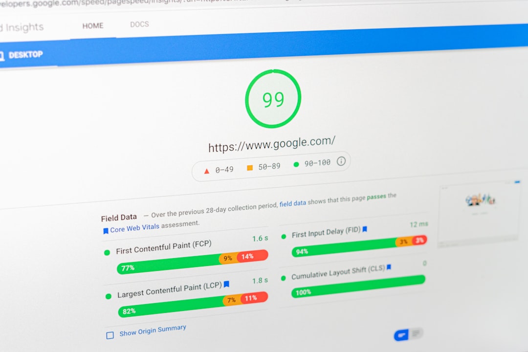
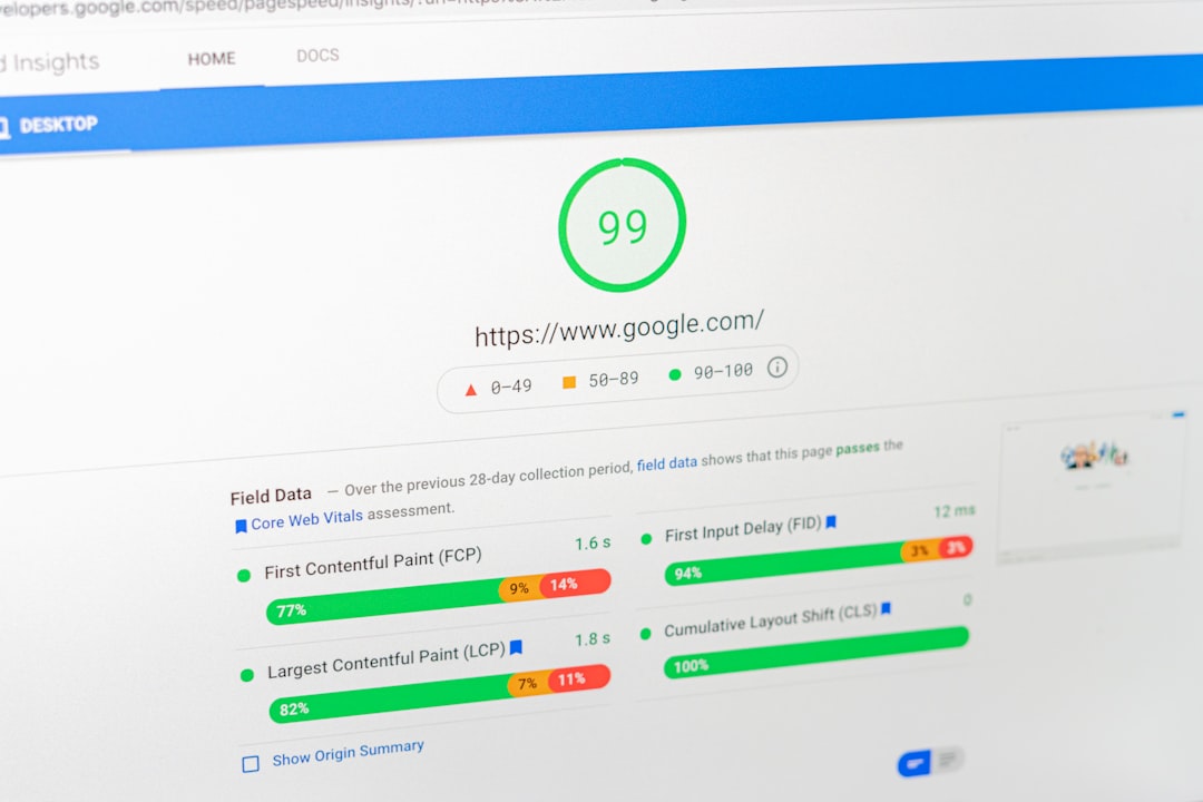
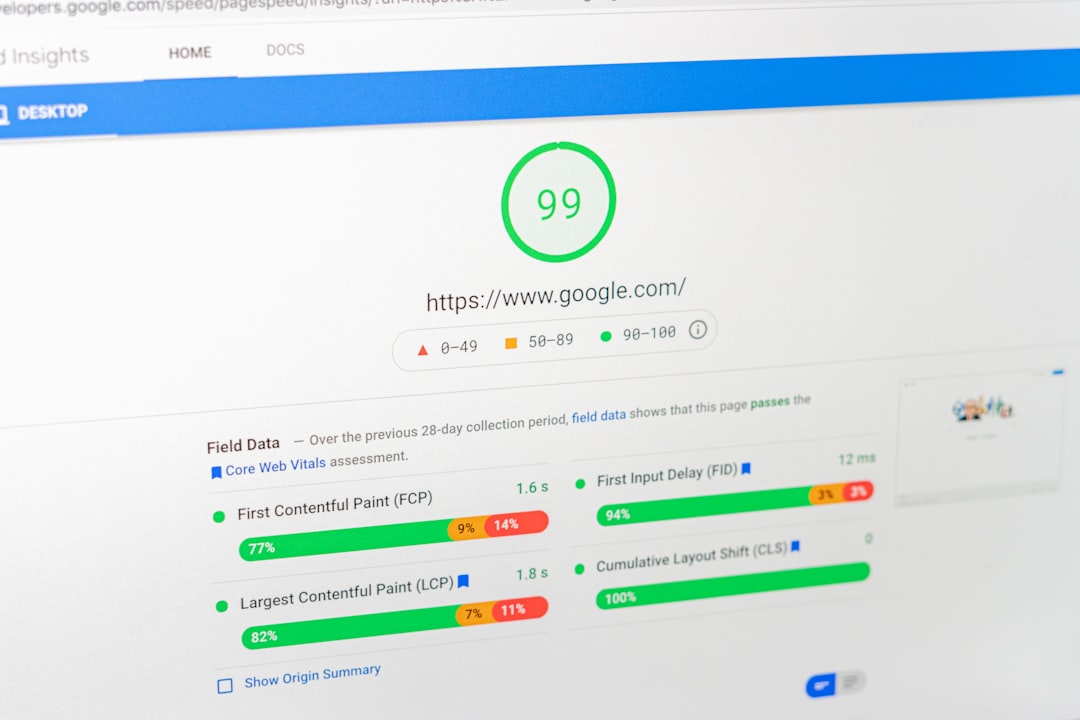
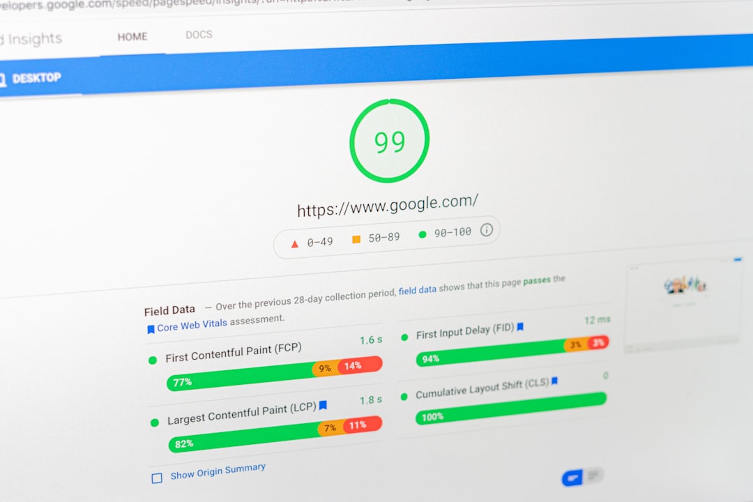
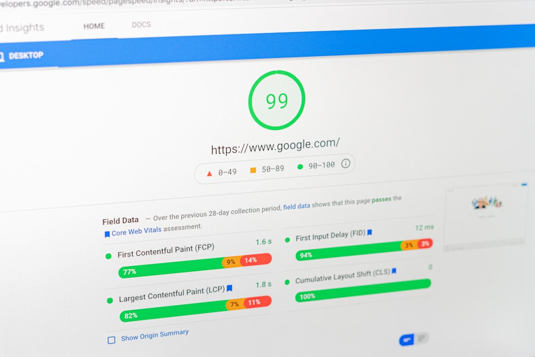
Google’s Core Web Vitals now use LCP, CLS, and INP, and INP replaced FID on March 12, 2024. PageSpeed Insights also combines lab data with real-world field data, so a single simulated result is helpful but not the whole story. Test your homepage, top service pages, blog posts, and WooCommerce templates separately because mobile bottlenecks often vary by template.
On WordPress, the biggest mobile gains usually come from compressing oversized images, limiting animation-heavy builders, delaying nonessential scripts, cleaning up third-party widgets, and using caching well. One well-configured SEO plugin is enough. Running overlapping plugins often creates duplicate metadata, conflicting canonicals, and extra code weight without improving rankings.
4. Make navigation and forms easy to use on phones
Mobile SEO is tied to usability because poor navigation quietly weakens engagement and completion rates. If menus are cluttered, buttons are cramped, or forms are painful to finish on a phone, users leave before your page proves its value.
Keep primary actions visible, reduce menu sprawl, use readable font sizes, and make tap targets comfortable. Service sites should make calls, forms, and location details easy to reach. WooCommerce stores should pay close attention to filters, variation selectors, carts, and checkout steps on smaller screens.
5. Check titles and snippets for mobile search results
Mobile search results have less room, so bloated titles waste space fast. Write concise, descriptive titles that lead with the real topic instead of stuffing repeated terms into the front of every page.
Google recommends descriptive, concise titles and warns against repetitive boilerplate and keyword stuffing. A green light in an SEO plugin does not mean the page deserves to rank. Clear titles, distinct intent, and strong on-page alignment matter more than forcing every variation into one tag.
| Weak mobile title | Stronger mobile title |
|---|---|
| SEO Services | SEO Company | SEO Expert | WordPress SEO Services for Small Businesses |
| Mobile SEO | WordPress Mobile SEO | SEO Mobile | WordPress Mobile SEO Fixes That Improve Rankings |
| Page Speed Tips for WordPress Websites | How to Speed Up WordPress for Mobile Users |
Common WordPress mobile SEO mistakes
Most mobile SEO problems are not dramatic. They are smaller configuration and template issues that compound over time. The fastest wins usually come from removing friction and inconsistency, not from publishing more content before the site is ready.
Watch for these patterns: desktop-only content blocks, sticky elements that cover headings, giant uncompressed images, accordion sections that fail to load, mobile menus that bury important pages, intrusive popups, and plugins that inject scripts across every template. If your site slowed down after feature stacking, compare what is truly essential with what is just adding code.
If you are already troubleshooting plugin overlap, our guide to Yoast SEO vs Rank Math can help you simplify your setup before you create more conflicts.
A practical mobile SEO checklist
Use this checklist to spot the issues that matter most without turning mobile SEO into a month-long rebuild. The goal is not perfection. The goal is a clean, usable mobile experience on the pages that drive leads, calls, and sales.
| Check | What good looks like |
|---|---|
| Theme and layout | Responsive templates render cleanly across common phone sizes |
| Content parity | Mobile keeps the same core copy, headings, links, and metadata as desktop |
| Performance | Key templates load without heavy image or script bottlenecks |
| Navigation | Important pages are easy to reach from menus and in-content links |
| Forms and CTAs | Buttons, fields, and click-to-call actions are easy to use on touch screens |
| Plugin setup | One primary SEO plugin, clean caching, limited overlapping features |
If you are not sure whether your current mobile setup is helping or quietly hurting you, WordPress SEO Expert can help. We can review the templates, plugin stack, internal links, and mobile rendering issues that often hold WordPress sites back.
The best next step
The best next step is to audit the pages that already matter most on phones, not to rebuild everything at once. Start with your top service pages, highest-impression blog posts, and any WooCommerce templates where mobile users are most likely to bounce or abandon the journey.
Most site owners do not have one catastrophic problem. They have a stack of smaller issues that compound over time. Fix the issues that block visibility before the issues that polish visibility. You do not need a perfect score. You need a site that loads cleanly, keeps its content intact, and is easy to use on a phone.
Book a free SEO consultation with WordPress SEO Expert. No pitch, no pressure. Just an honest look at what your site actually needs and whether your current setup is part of the solution or part of the problem.
Contact WordPress SEO Expert today to schedule a consultation.