A WordPress SEO strategy should always consider mobile visitors. People increasingly browse websites on phones and tablets, so a page that works well only on a desktop can create a poor experience for a large part of the audience.
Mobile optimization is not simply about shrinking a desktop page. It involves making navigation, content, images, buttons, and page performance work properly on smaller screens.
Use a Responsive WordPress Design
Start with a responsive theme or design that adapts to different screen sizes.
Check important pages on multiple devices and look for:
- Text that is difficult to read
- Horizontal scrolling
- Overlapping elements
- Buttons that are difficult to tap
- Menus that are hard to use
- Images extending beyond the screen
A responsive layout should allow visitors to navigate comfortably without constantly zooming or adjusting the page.
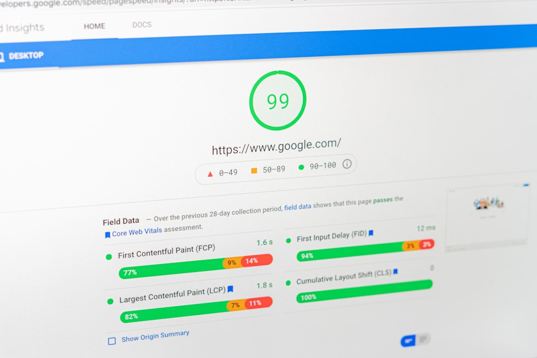
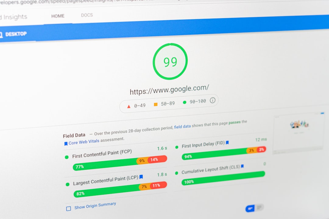
Improve Mobile Page Speed

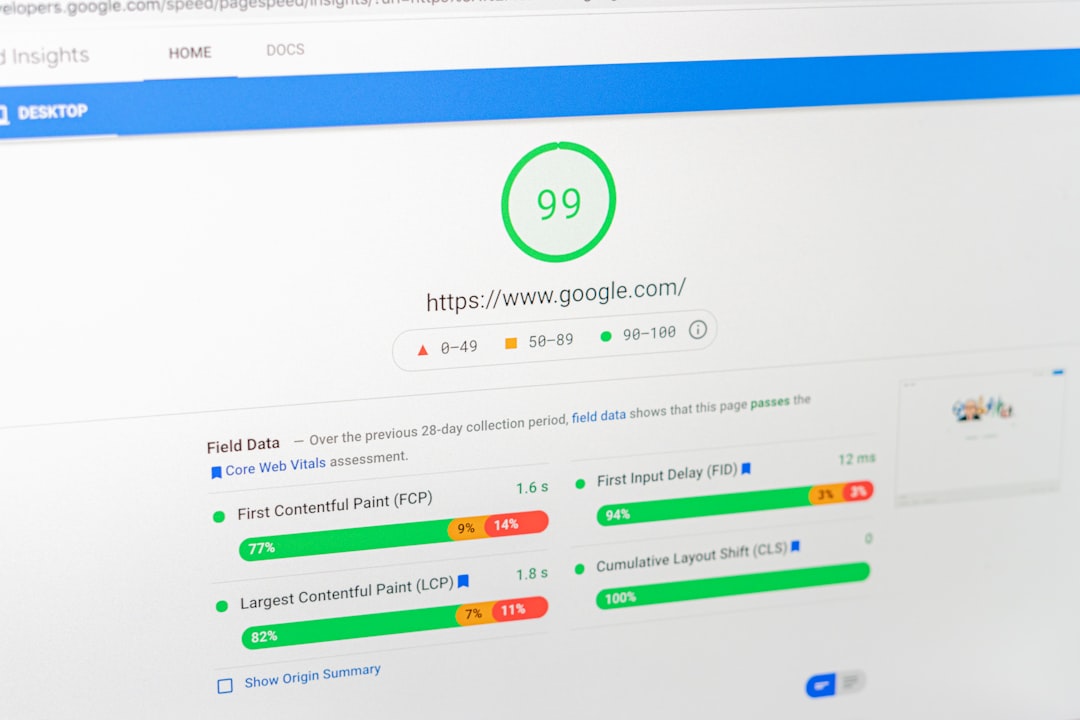
Mobile users may browse on slower connections or less powerful devices, making performance especially important.
Large images, unnecessary scripts, excessive plugins, and poorly optimized resources can contribute to slower pages.
Review your website and reduce avoidable page weight where possible.
Compress appropriate images, use suitable image dimensions, and review plugins that may load unnecessary resources.
Make Navigation Simple
Mobile screens provide less space for menus.
Keep navigation focused on the most important pages. Visitors should be able to reach major services, products, categories, or contact information without navigating through a complicated menu.
A simple mobile menu can make a significant difference to usability.
Make Content Easy to Read
Large blocks of text can be difficult to read on a phone.
Use:
- Short paragraphs
- Clear headings
- Bullet points
- Tables where useful
- Descriptive links
- Enough spacing
Break complex explanations into smaller sections so readers can scan the page easily.
Optimize Images
Images can improve content, but oversized files can slow mobile pages.
Before uploading images, consider their actual display size. Compress suitable files and use appropriate formats.
Add alt text when it helps communicate the image’s meaning or function.
Do not use alt text as a keyword-stuffing technique.
Review Forms and Buttons
Forms are particularly important for business websites.
Test contact forms, newsletter forms, booking forms, and checkout processes on mobile devices.
Buttons should be easy to identify and tap. Forms should not require unnecessary effort or excessive typing.
A visitor who wants to contact a business should not struggle to complete a basic form.
Avoid Intrusive Elements
Pop-ups and banners can be useful, but excessive interruptions can make mobile pages frustrating.
Review how promotional elements appear on smaller screens. Make sure important content remains accessible and visitors can easily close unnecessary overlays.
Check Mobile SEO Data
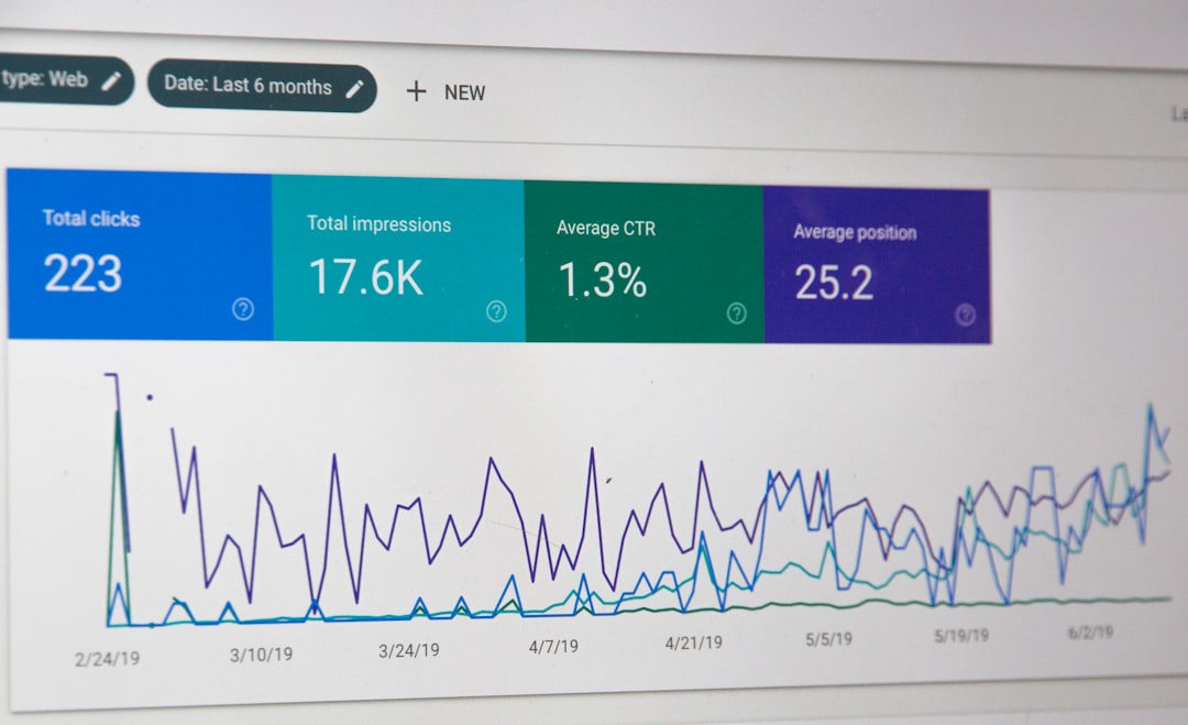
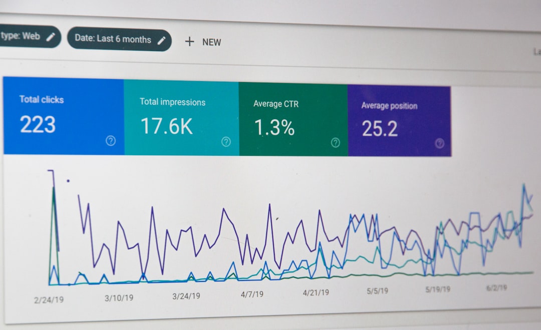
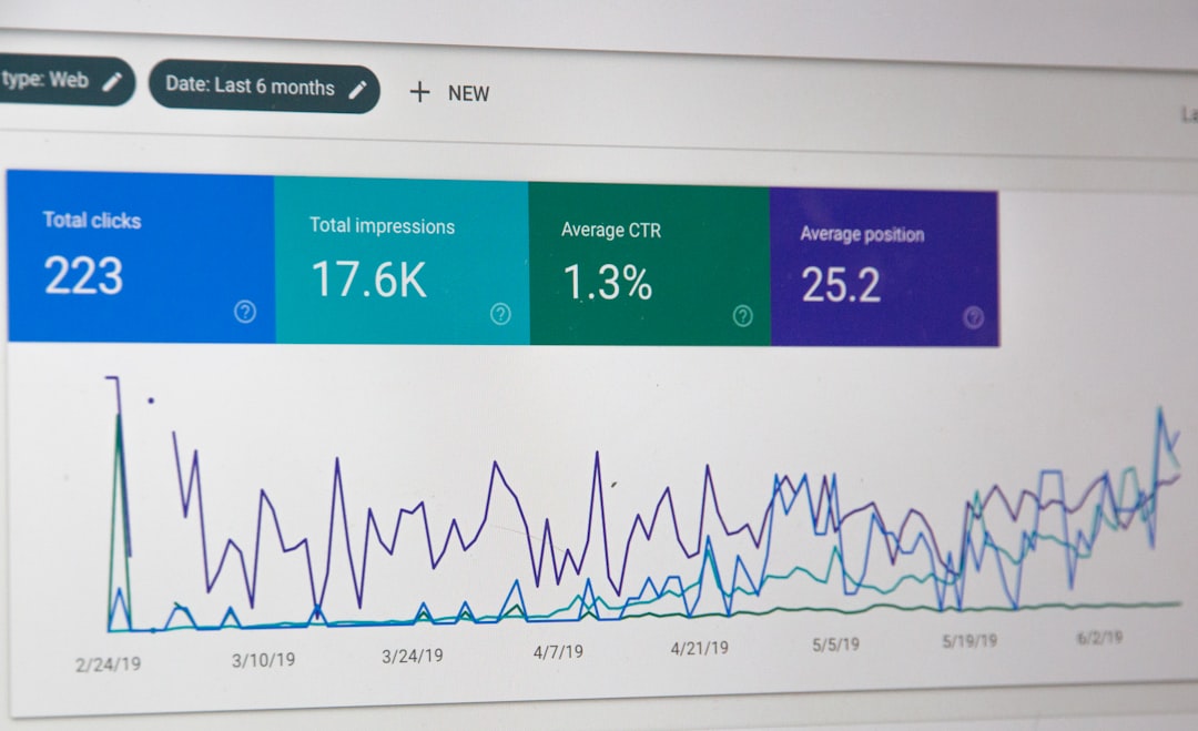
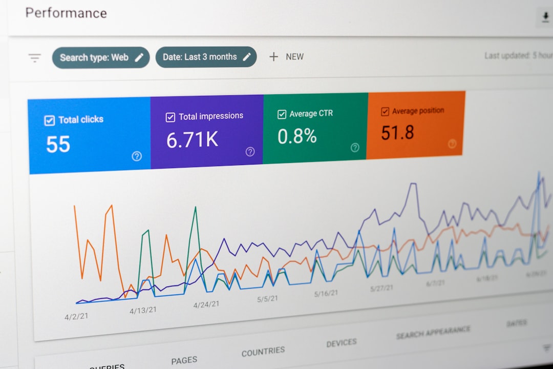
Google Search Console and analytics tools can help identify pages that need attention.
Look at important landing pages and compare their traffic, engagement, and search performance.
If a page receives search traffic but users leave quickly or fail to complete important actions, review its mobile experience rather than assuming the problem is purely SEO-related.
Test Important Pages Regularly
Mobile optimization should be part of routine website maintenance.
Test:
| Area | What to Check |
|---|---|
| Navigation | Menus are easy to use |
| Content | Text is readable |
| Images | They fit correctly |
| Buttons | Easy to tap |
| Forms | Work without problems |
| Speed | Pages load efficiently |
| Layout | No unwanted horizontal scrolling |
Do not test only the homepage. Service pages, product pages, blog posts, and contact pages may behave differently.
Connect Mobile Optimization With SEO
Mobile optimization supports the broader SEO strategy because search visibility and user experience are closely connected.
A page should not only be discoverable through search; it should also provide a smooth experience after the visitor arrives.
For businesses that have complex WordPress websites, a WordPress SEO consultant can review mobile performance alongside technical SEO, content, and conversion paths.
The goal is simple: make every important page useful, accessible, and easy to navigate regardless of the device being used.