
Mobile devices now account for a major share of website traffic. People search, compare businesses, read content, and make purchases directly from their phones. For a WordPress website, having a mobile-friendly design is therefore not just about appearance. It can affect usability, engagement, and how effectively your site performs in search.
A WordPress SEO company can help identify mobile SEO problems and optimize the website so visitors get a smoother experience across smartphones and tablets.
Why Mobile Optimization Matters for WordPress SEO
Google uses mobile-first indexing, which means the mobile version of a website is particularly important for how pages are understood and indexed.
If your website works well on a desktop but becomes difficult to use on a phone, visitors may leave quickly. Common problems include:
- Text that is too small to read
- Buttons that are difficult to tap
- Images that take too long to load
- Content extending beyond the screen
- Slow-loading pages
- Intrusive pop-ups
- Poor navigation
These problems can affect both user experience and organic search performance.
Check Your WordPress Website’s Mobile Design

The first step is to examine how the website behaves on different screen sizes.
A responsive WordPress theme should automatically adjust layouts, images, menus, and content according to the device. However, simply using a responsive theme does not guarantee that every page is properly optimized.
Check important pages such as:
- Homepage
- Service pages
- Product pages
- Blog posts
- Contact page
- Landing pages
Pay particular attention to navigation and important calls to action.
For example, if a visitor has to zoom in before they can click your contact button, the page needs improvement.
Improve Mobile Page Speed
Speed is one of the most important parts of mobile optimization.
Mobile users may have slower connections than desktop users, so large images, unnecessary scripts, and poorly configured plugins can create frustrating delays.
A WordPress SEO company may review:
| Area | Possible Improvement |
|---|---|
| Images | Compress and resize images |
| Plugins | Remove unnecessary plugins |
| CSS | Reduce unused CSS |
| JavaScript | Minimize unnecessary scripts |
| Caching | Configure suitable caching |
| Hosting | Upgrade slow hosting when necessary |
| Fonts | Reduce unnecessary font requests |
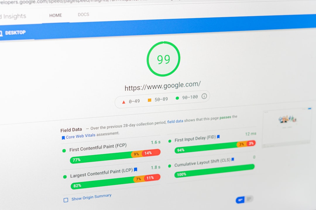
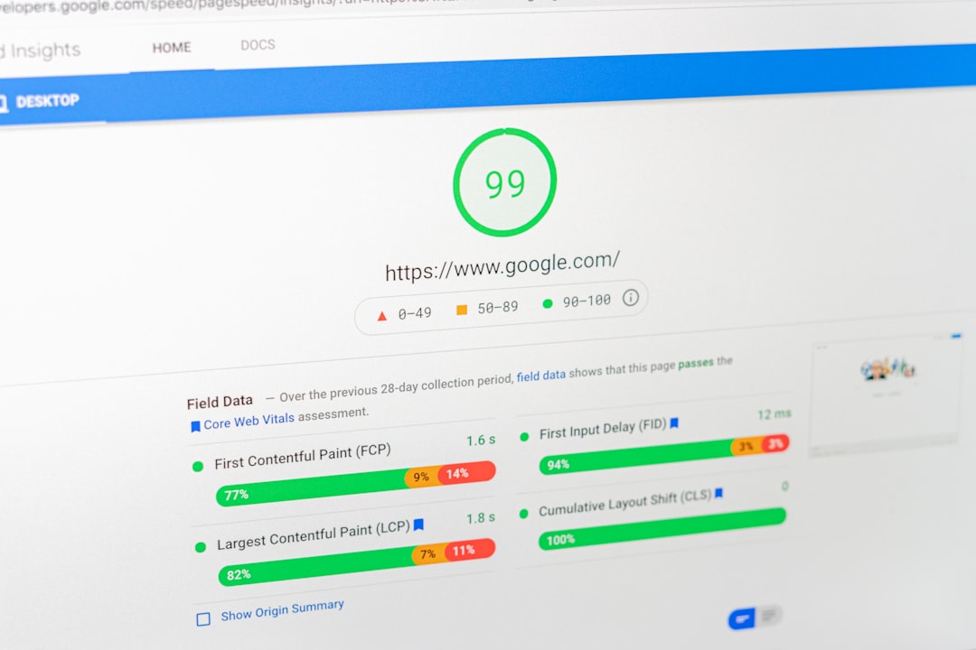
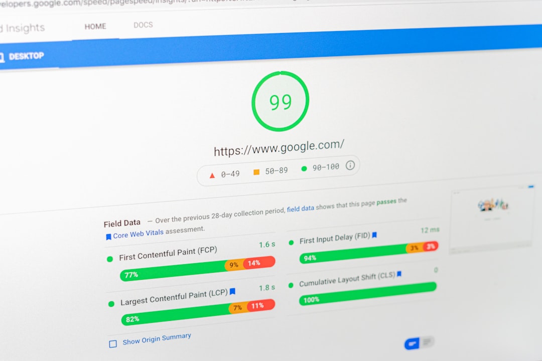
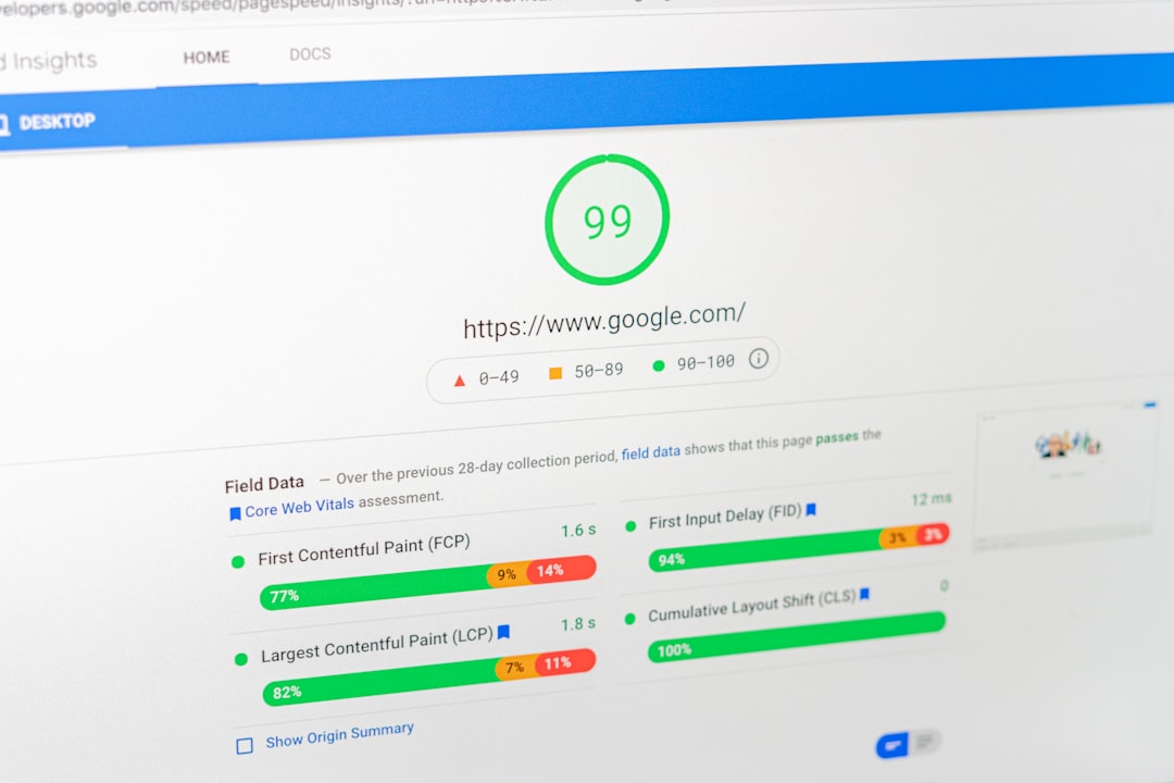
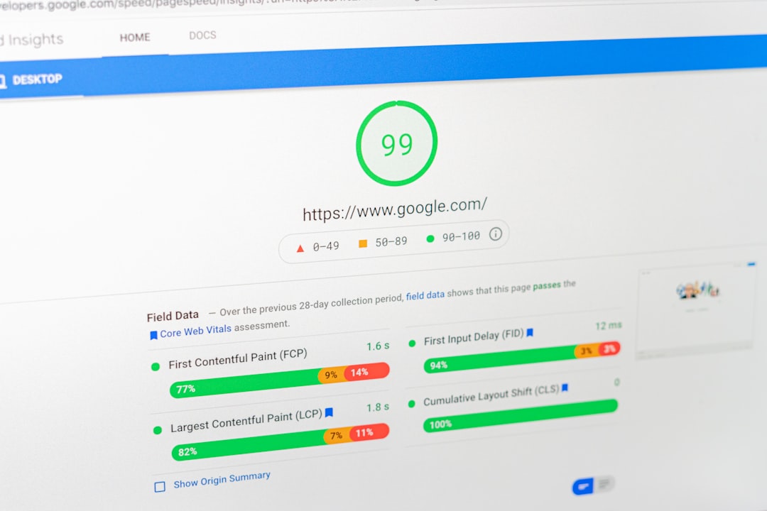
Tools such as PageSpeed Insights and other performance testing platforms can help identify technical issues.
Optimize Images for Mobile
Large images are a common reason WordPress pages load slowly.
Instead of uploading a huge image and displaying it at a small size, use an appropriately sized image. Modern formats such as WebP can also reduce file size while maintaining good visual quality.
Do not forget descriptive alt text. Alt text should explain the image naturally and should not be filled with keywords.
Make Mobile Navigation Simple
Mobile visitors should be able to understand your website quickly.
A complicated navigation menu can make it difficult for users to find important pages. Keep the primary menu focused on the most useful sections.
For example:
Home → Services → About → Blog → Contact
can be easier to use than a menu containing dozens of links.
Your search function, menu button, contact options, and other interactive elements should also be easy to tap.
Improve Mobile Content
Mobile readers prefer content that is easy to scan.
Use:
- Short paragraphs
- Clear headings
- Bullet points
- Descriptive subheadings
- Adequate spacing
- Important information near the beginning
Avoid large blocks of text that force users to scroll through a wall of content.
The goal is not to create separate content for mobile and desktop. Instead, the same valuable content should remain accessible and readable across devices.
Test Forms and Calls to Action
A mobile visitor might be ready to contact your business, request a quote, or make a purchase.
If your form is difficult to complete on a phone, you can lose potential leads.
Test:
- Contact forms
- Phone buttons
- Email links
- Checkout pages
- Appointment forms
- Download buttons
Every important action should work properly without requiring unnecessary zooming or horizontal scrolling.
Avoid Intrusive Mobile Pop-Ups

Pop-ups can be useful for newsletters, promotions, and lead generation, but they should not make the main content difficult to access.
If a mobile visitor immediately sees a large pop-up covering the page, they may leave before reading anything.
Use pop-ups carefully and make sure users can easily close them.
How a WordPress SEO Company Can Help
Mobile optimization involves more than changing a few design settings. A professional WordPress SEO company can review technical SEO, page speed, responsive design, content structure, images, navigation, and conversion elements together.
This is especially useful for larger websites where fixing one mobile issue may reveal another technical problem.
A proper mobile SEO process can include:
- Mobile usability review
- Speed and Core Web Vitals analysis
- Theme and layout inspection
- Image optimization
- Plugin and script review
- Navigation improvements
- Form and CTA testing
- Ongoing performance monitoring
Build for Mobile Users First
A strong WordPress website should not treat mobile optimization as an afterthought. Visitors should be able to browse, read, navigate, and take action comfortably regardless of the device they use.
With the right technical improvements and ongoing monitoring, a WordPress SEO company can help turn a mobile website from a basic responsive design into a faster, more useful search-friendly experience.